00 · Standard Reference
Sanity-check card confirming the pip/index layout engine works like a normal USPC-style face before we start bending it.
00
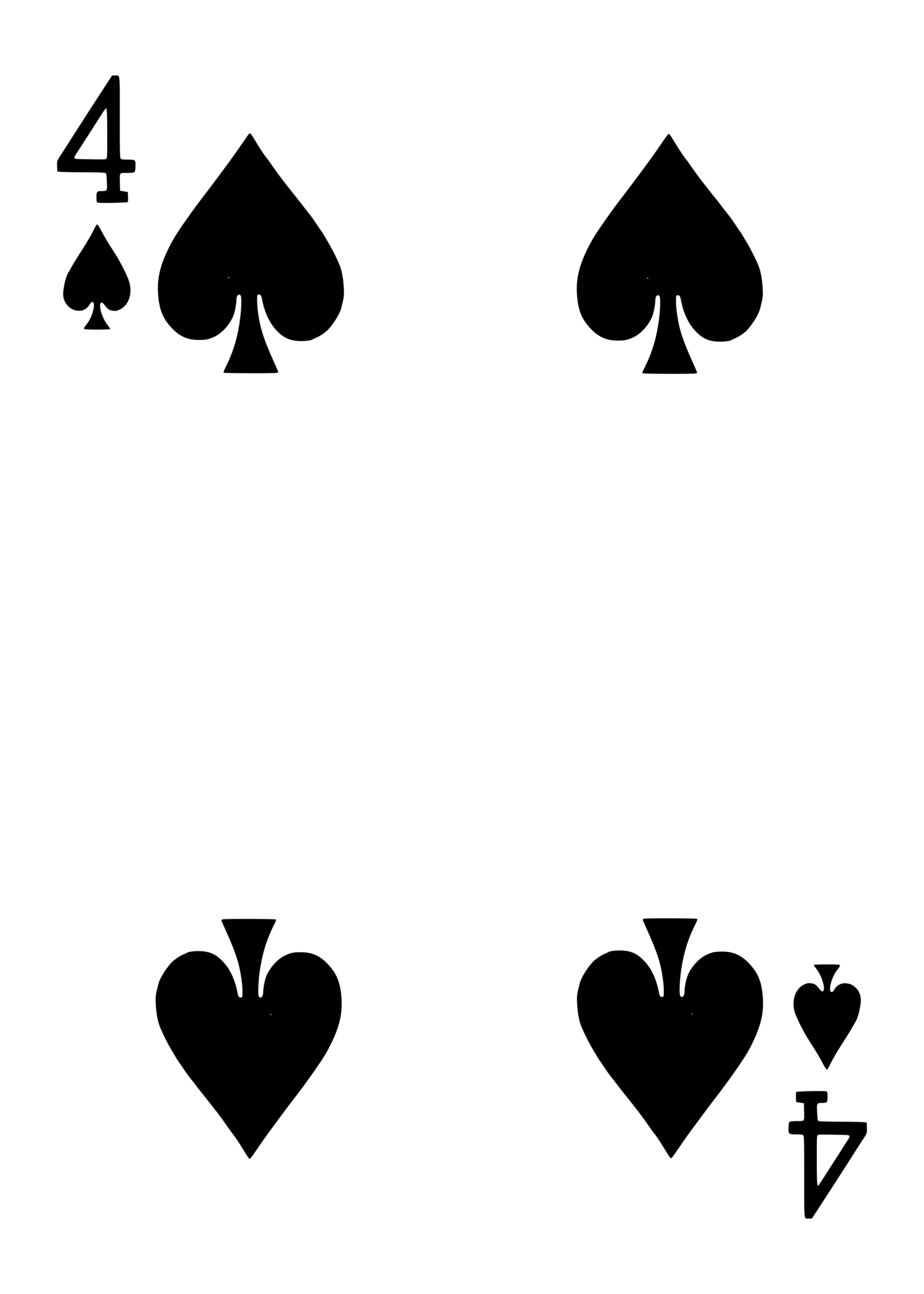
4♠ — standard layout
An evolving set of original playing-card gaff concepts and back designs — moving pips, forces, distress treatments, and more. All face art built from the LGPL-licensed "Vectorized Playing Cards 1.3" library (Chris Aguilar); backs are original artwork. Download anything you like and riff on it.
Sanity-check card confirming the pip/index layout engine works like a normal USPC-style face before we start bending it.
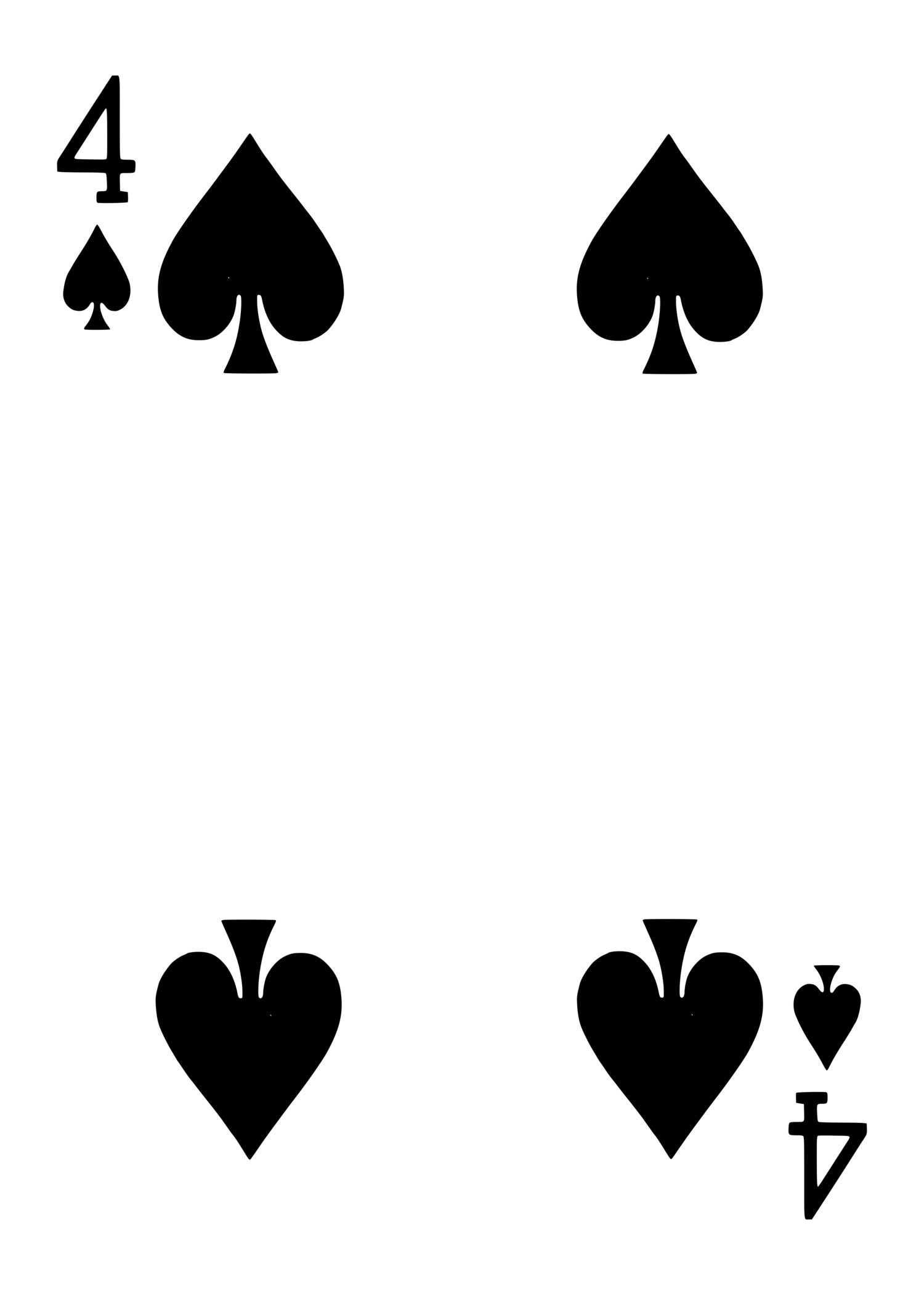
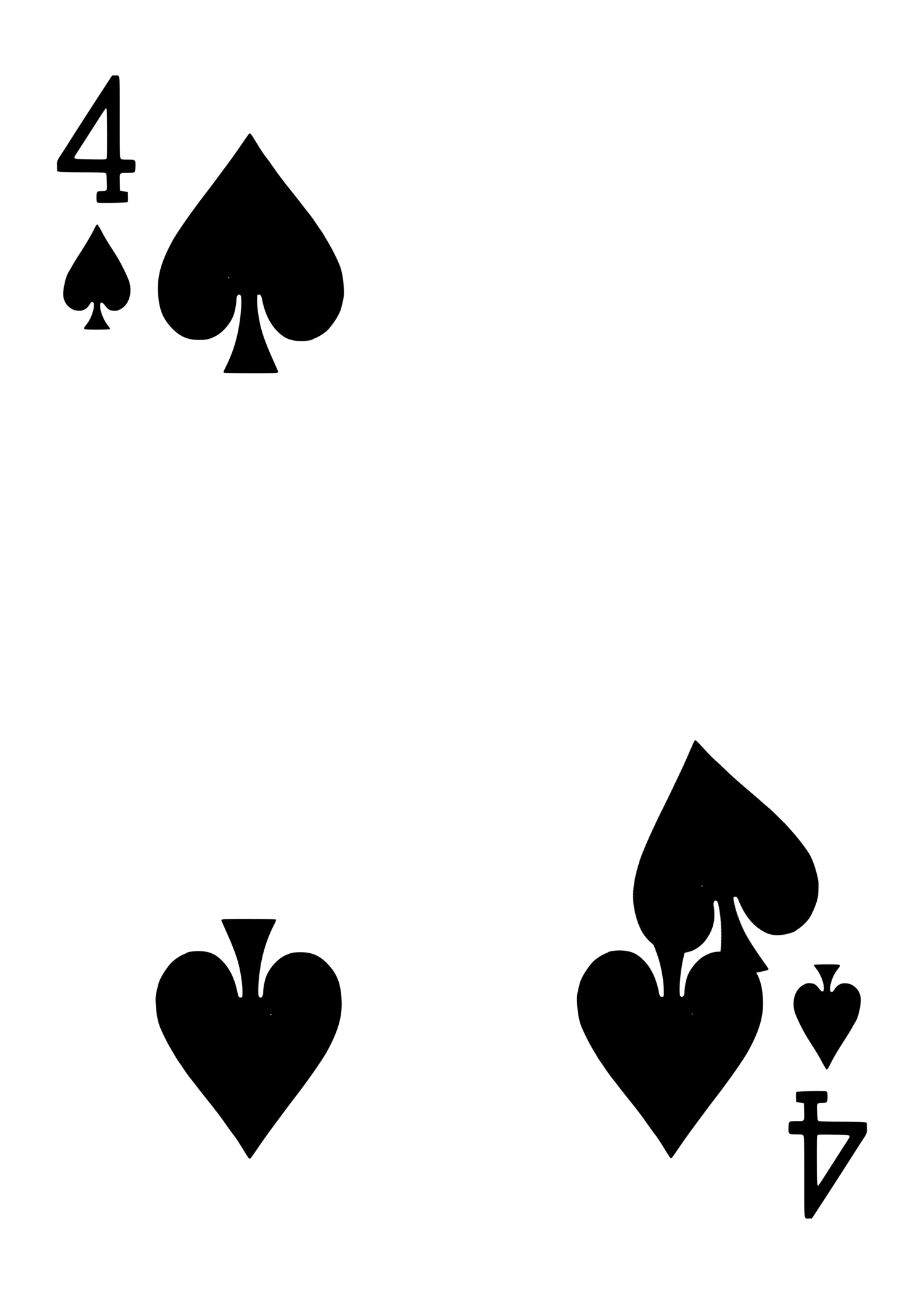
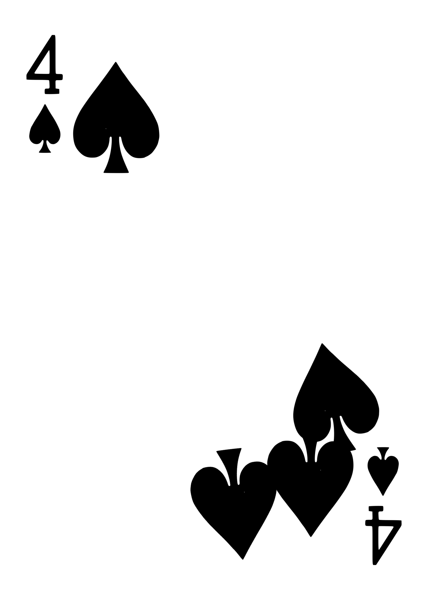
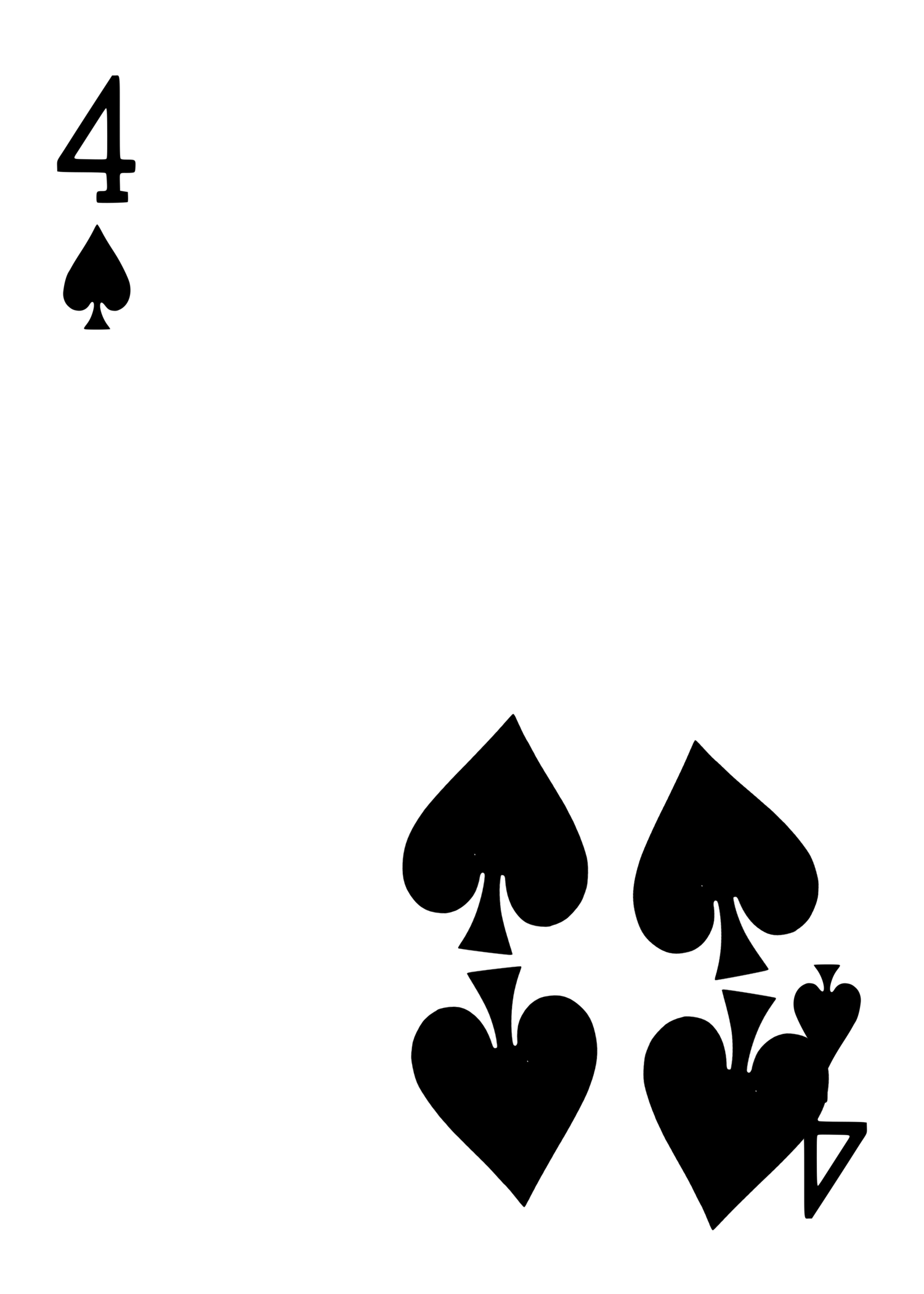
The pip-migration mechanic you referenced from the pip-matrix gaffs: same "4♠" index throughout, but the four pips physically relocate across the set, ending clustered in one corner. Flip through the 4 cards fast for the moving-pip flourish.
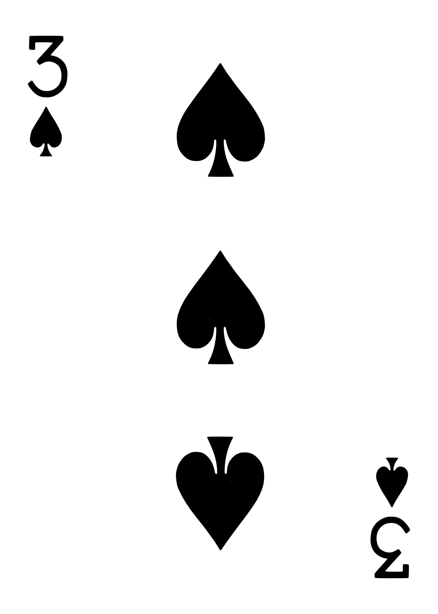
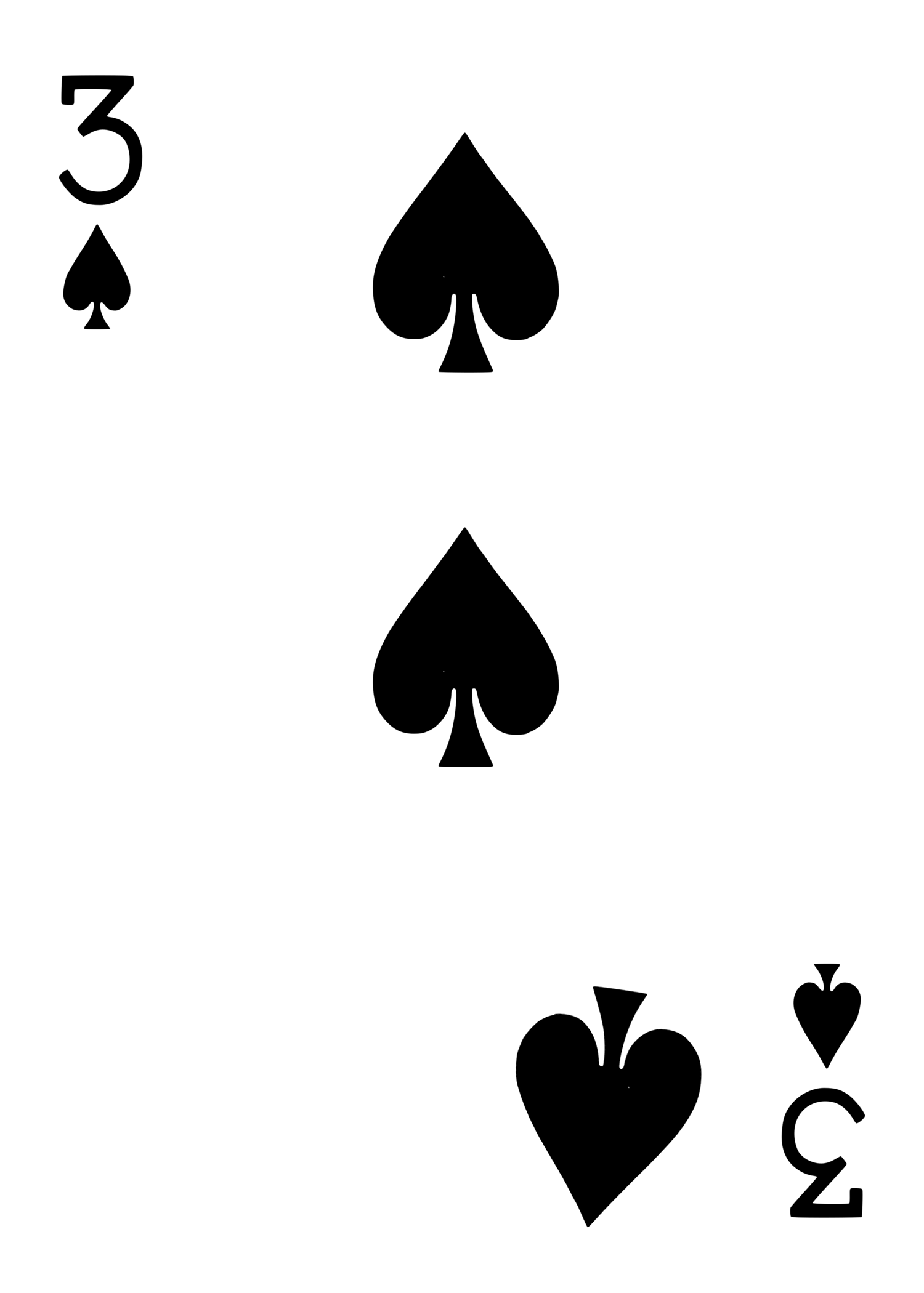
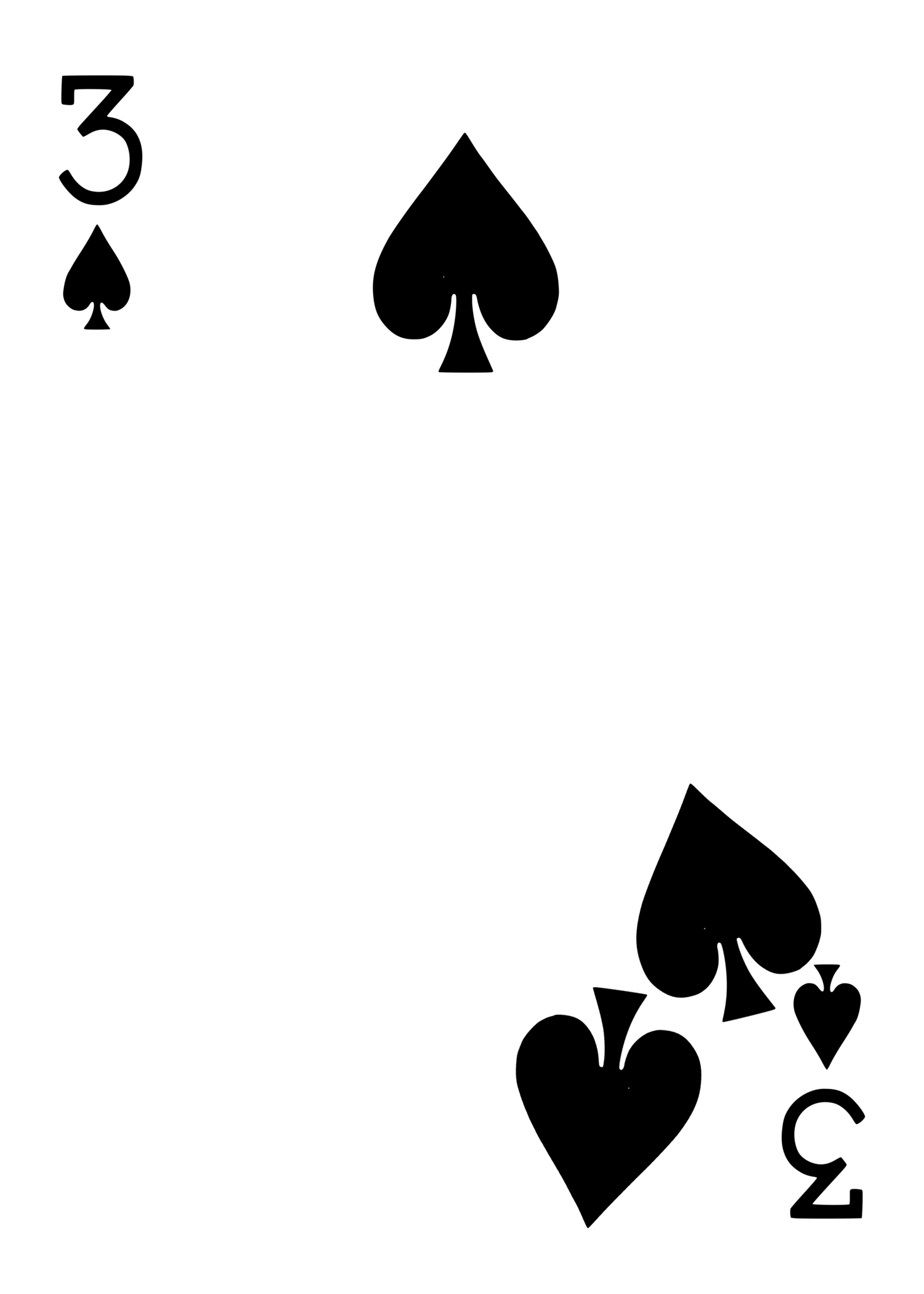
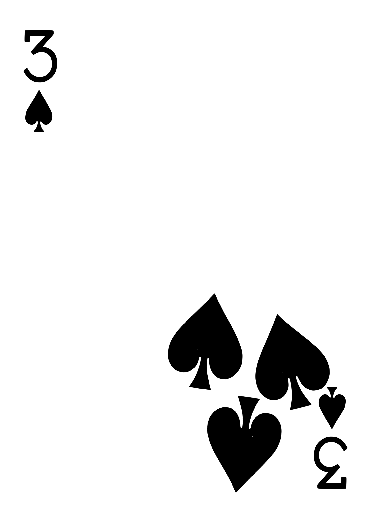
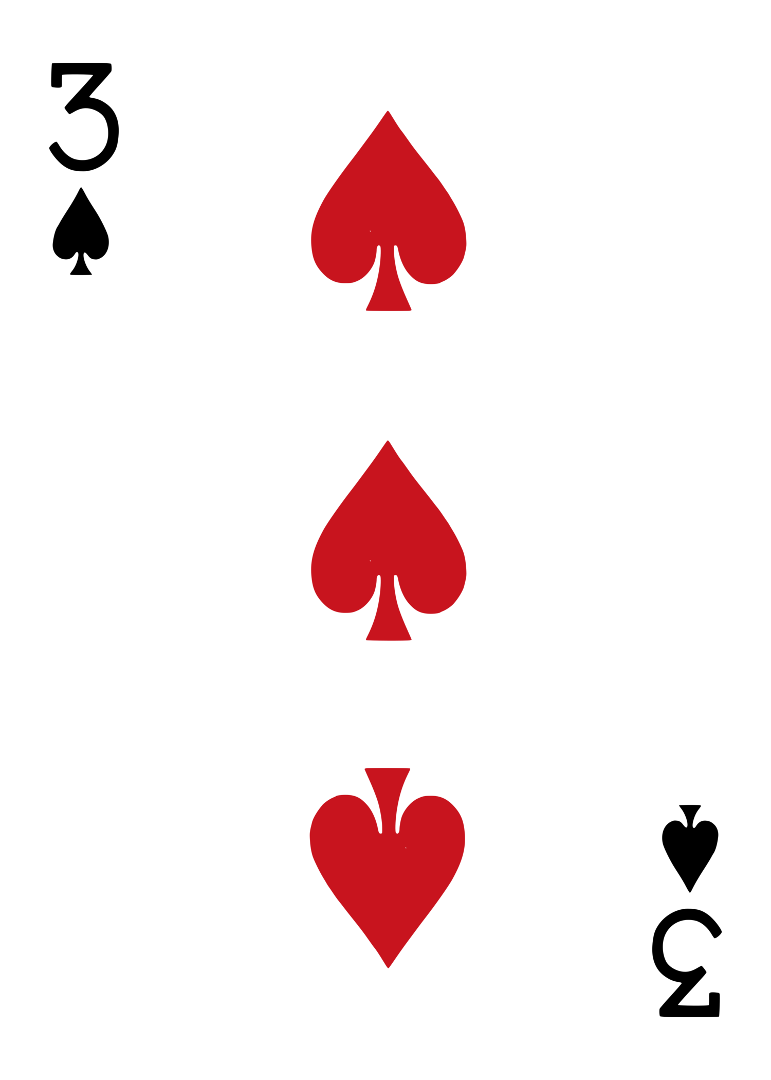
Same mechanic as 01–04, built on 3♠ instead: native pip size and orientation preserved throughout, migrating one-by-one into a tight non-overlapping cluster with a touch of hand-placed imperfection in position/rotation.
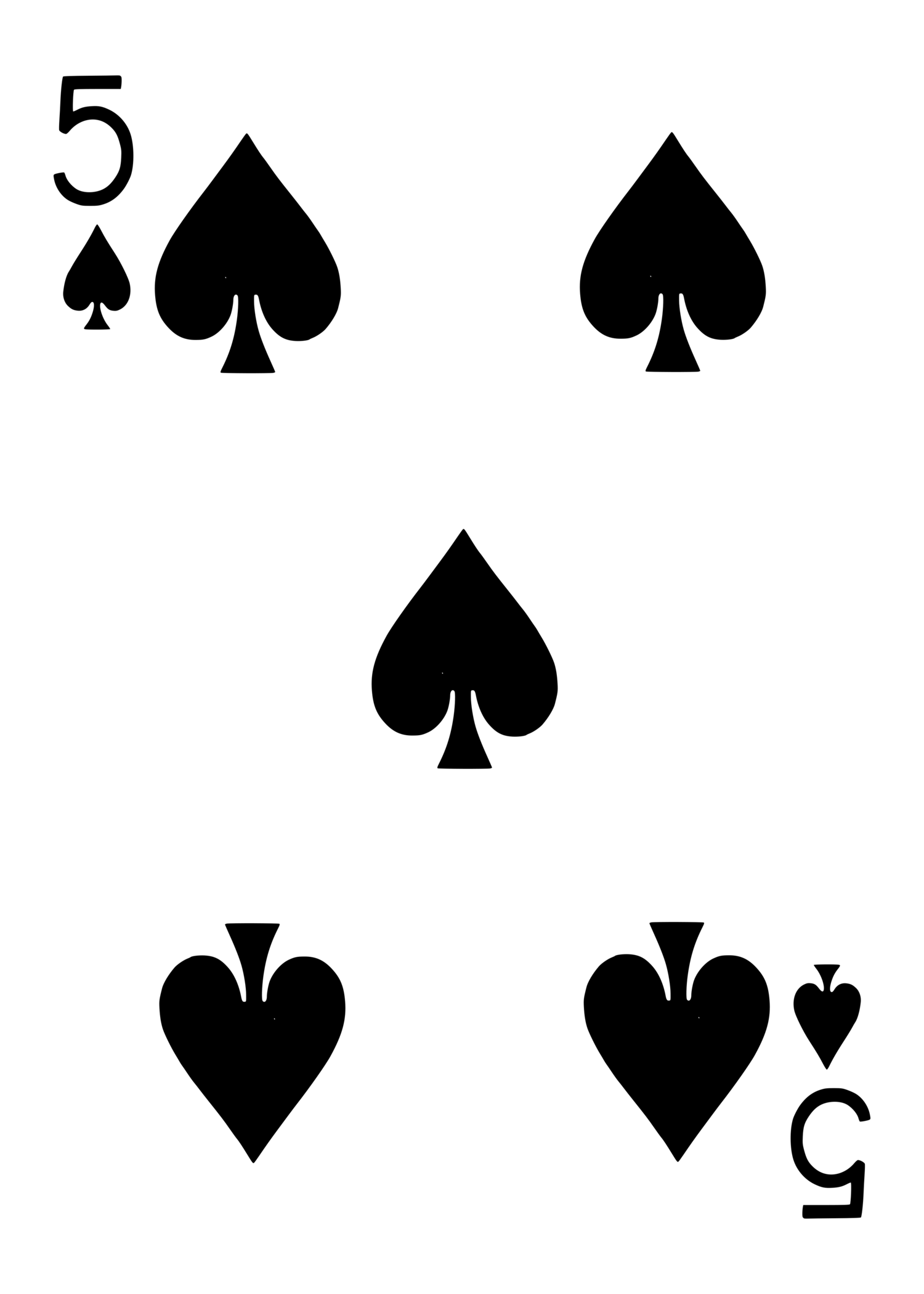
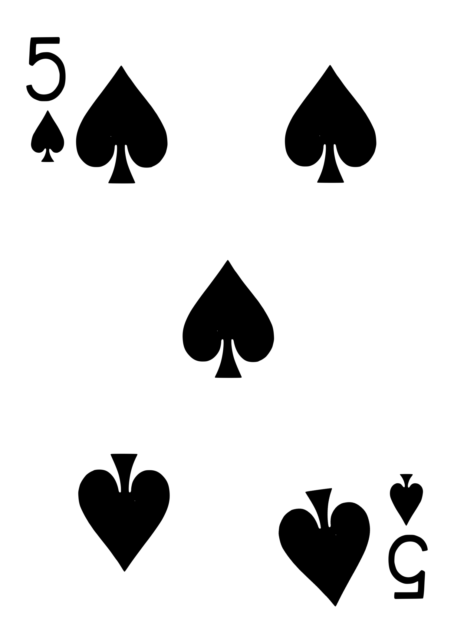
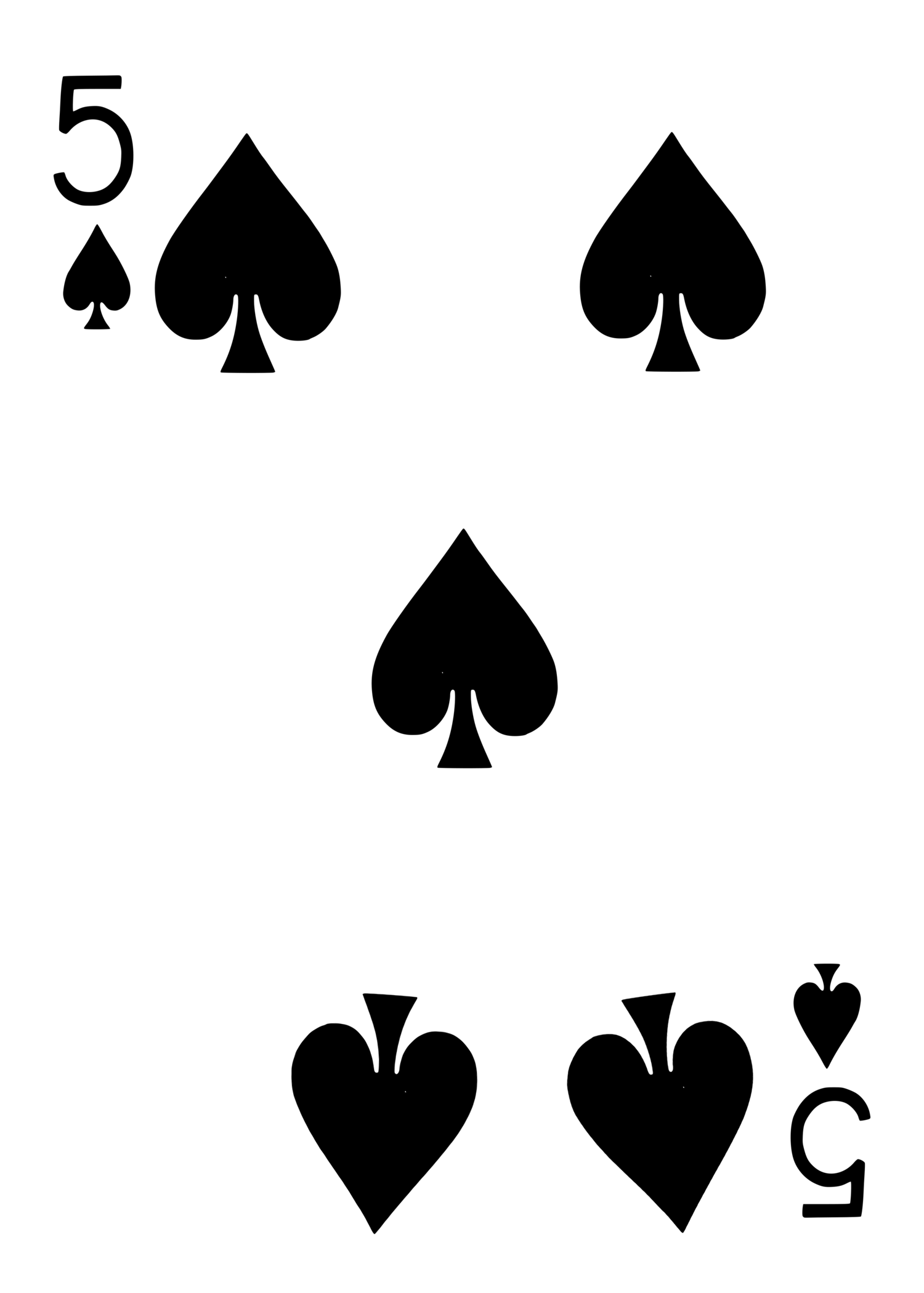
Same mechanic on 5♠ — one pip migrates per stage (bottom-right, bottom-left, center, top-right, top-left), ending in a 5-pip cluster, kept clear of the corner index.
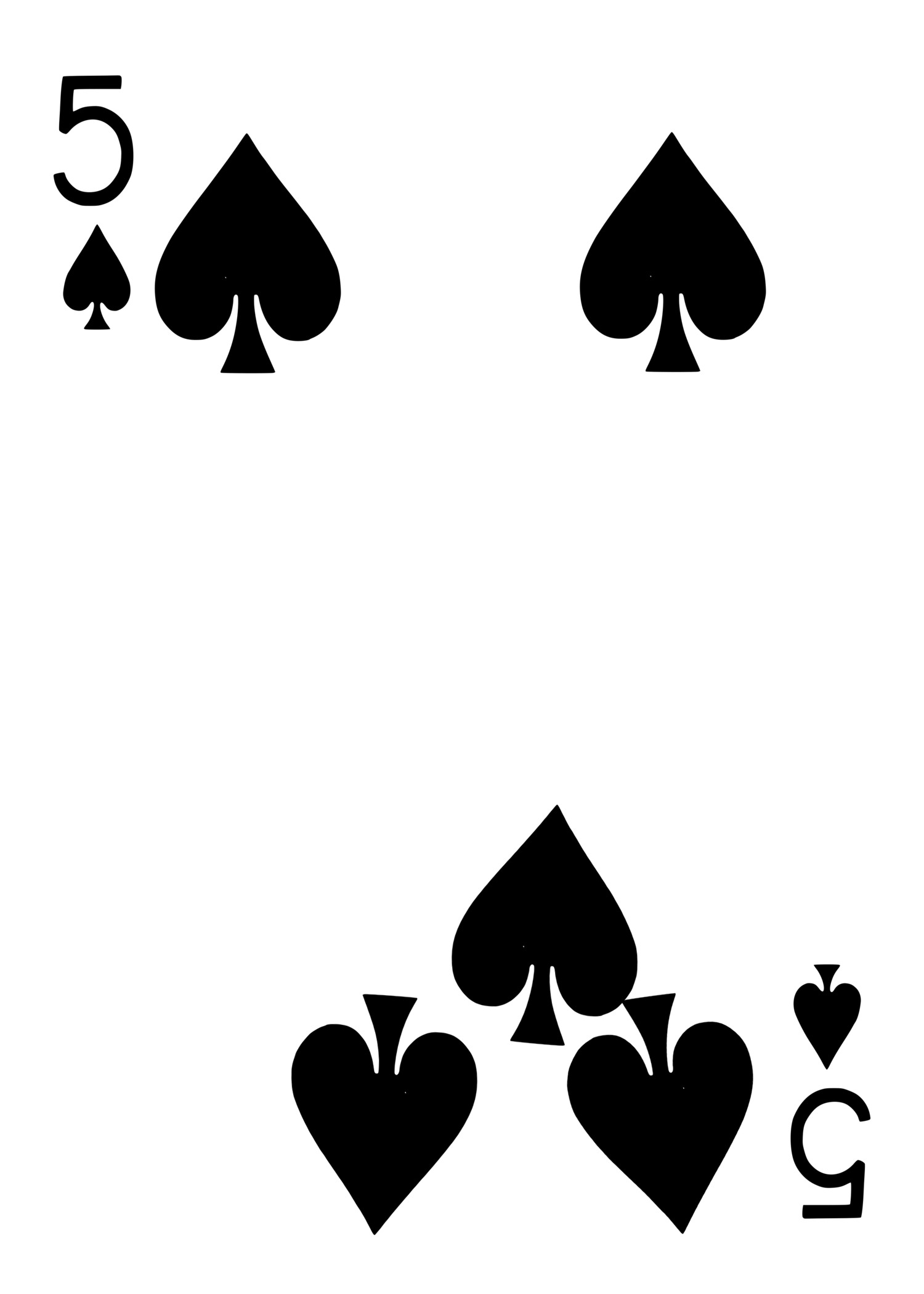
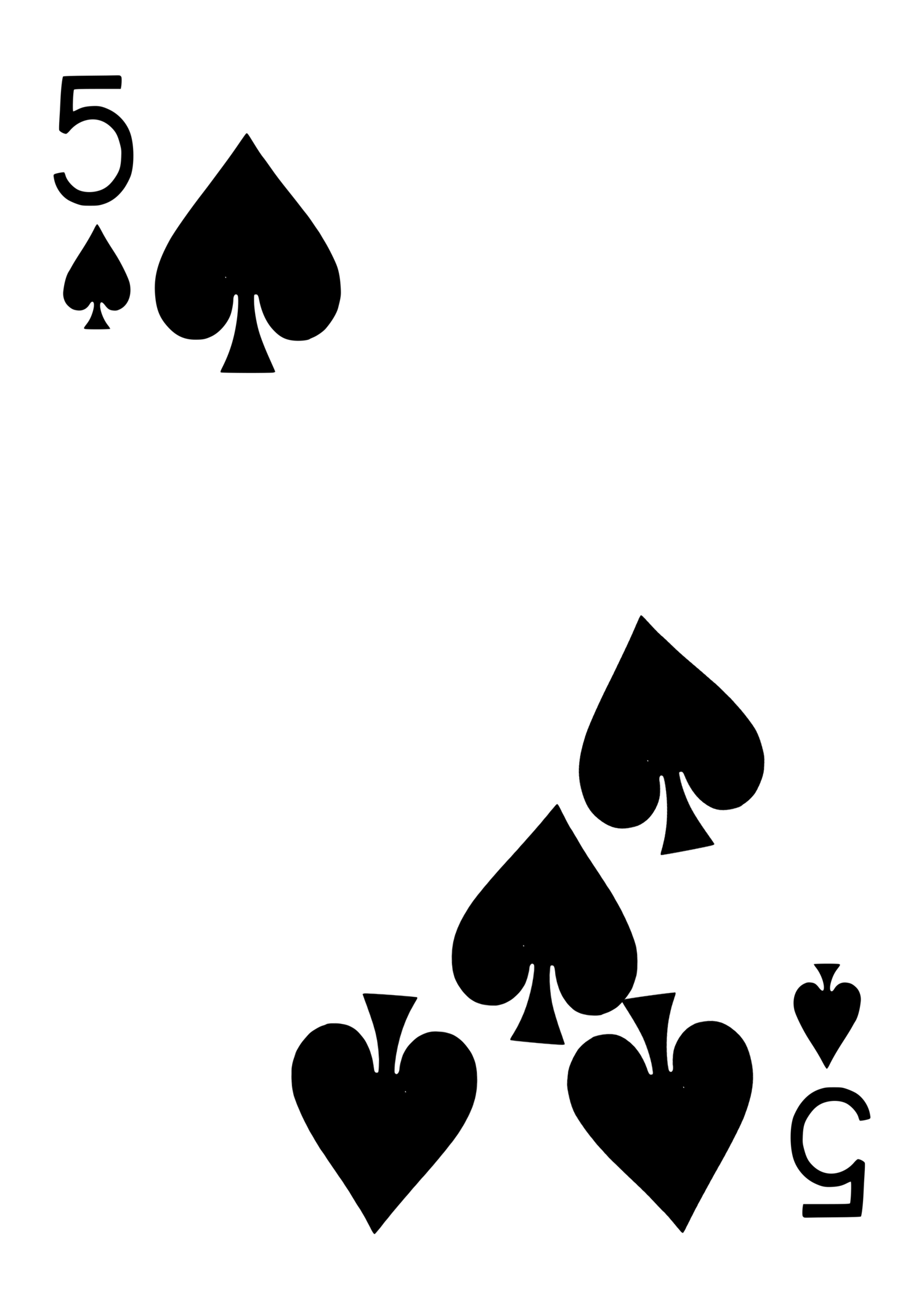
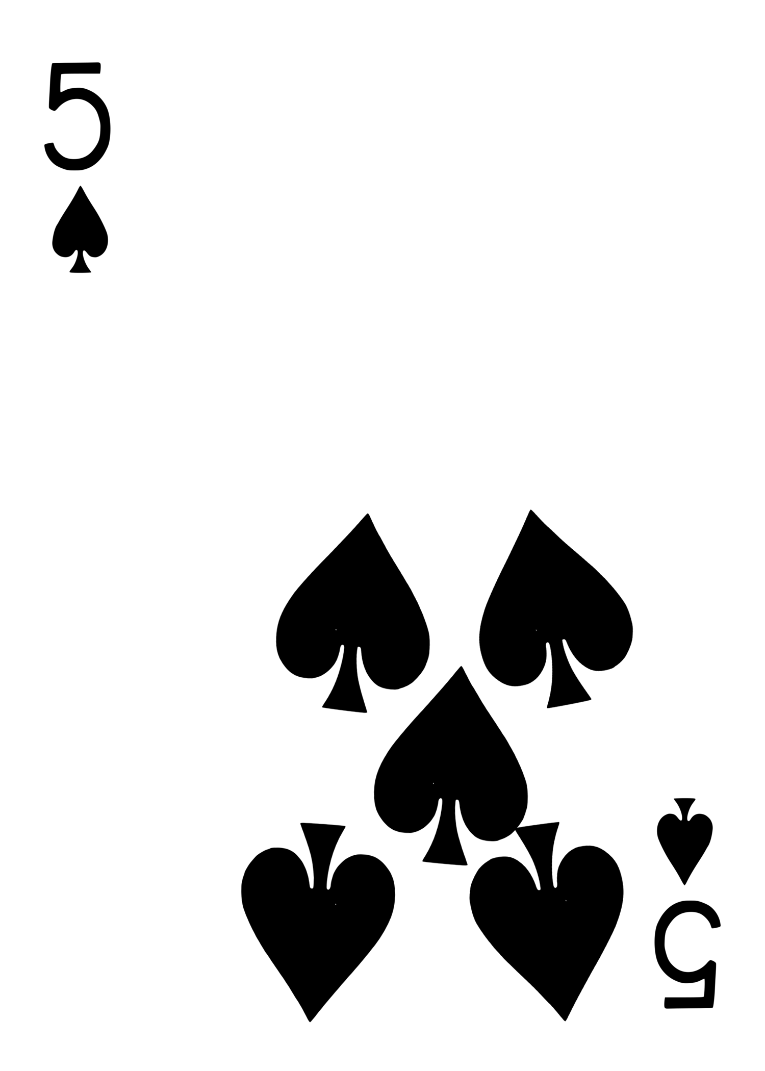
Same migration idea, different motion: pips tumble and scatter-pile toward the bottom edge instead of consolidating into a corner — a "gravity" gag rather than a "walk."
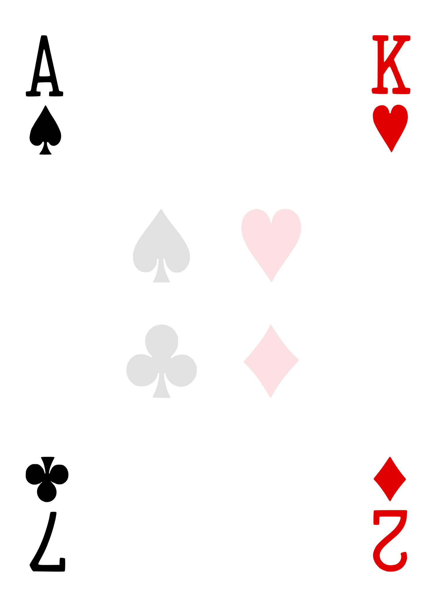
Four different corners, four different cards (A♠ / K♥ / 7♣ / 2♦) on one piece of stock — classic multiple-outs force gimmick. Faint ghosted compass of all four suits in the center as a subtle design touch.
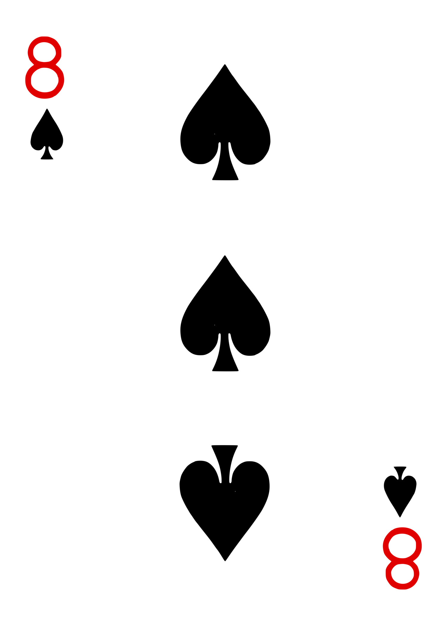
Corners read "8♦" but the center pips show 3♠ — exploits peripheral/quick-glance reading for a comedy reveal or force routine.
Same back design, but a small asymmetric mark breaks rotational symmetry — lets you spot a reversed card in the deck by eye. Shown right-side-up and rotated 180° so you can see the mark shift corners.
Foundational gaffs used underneath a lot of other routines (force decks, "any card at any number," etc.).


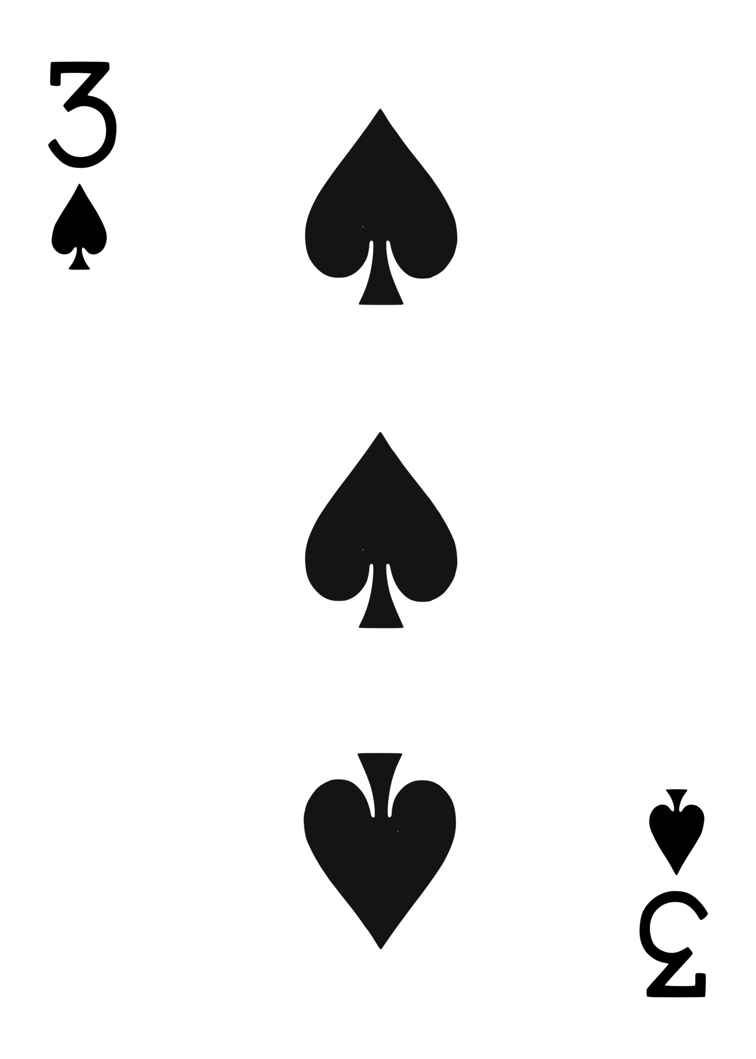
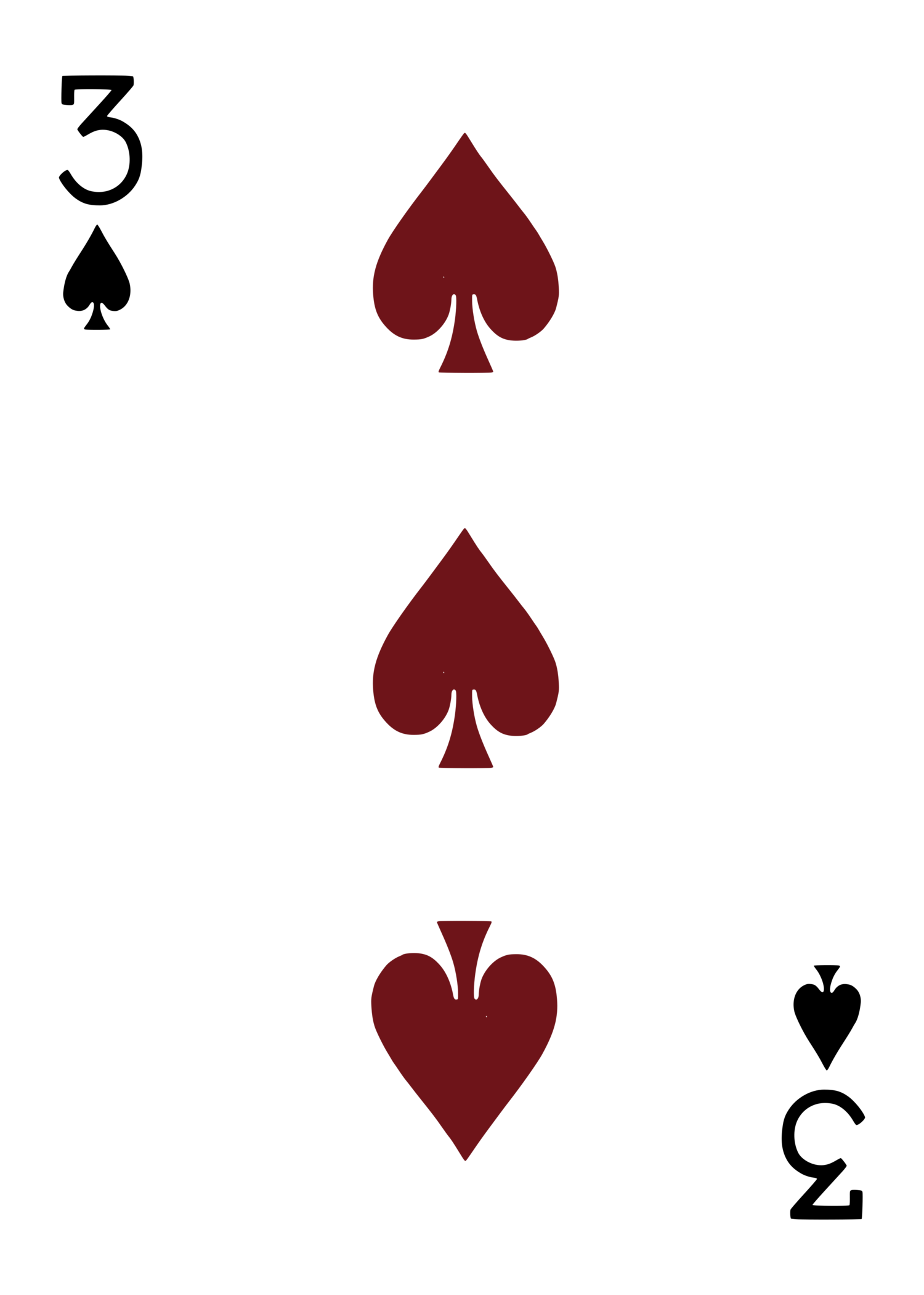
Same 3♠ across the set, but the pip color gradates black → maroon → red — a "color changing" flourish set for a visual color-change bit.
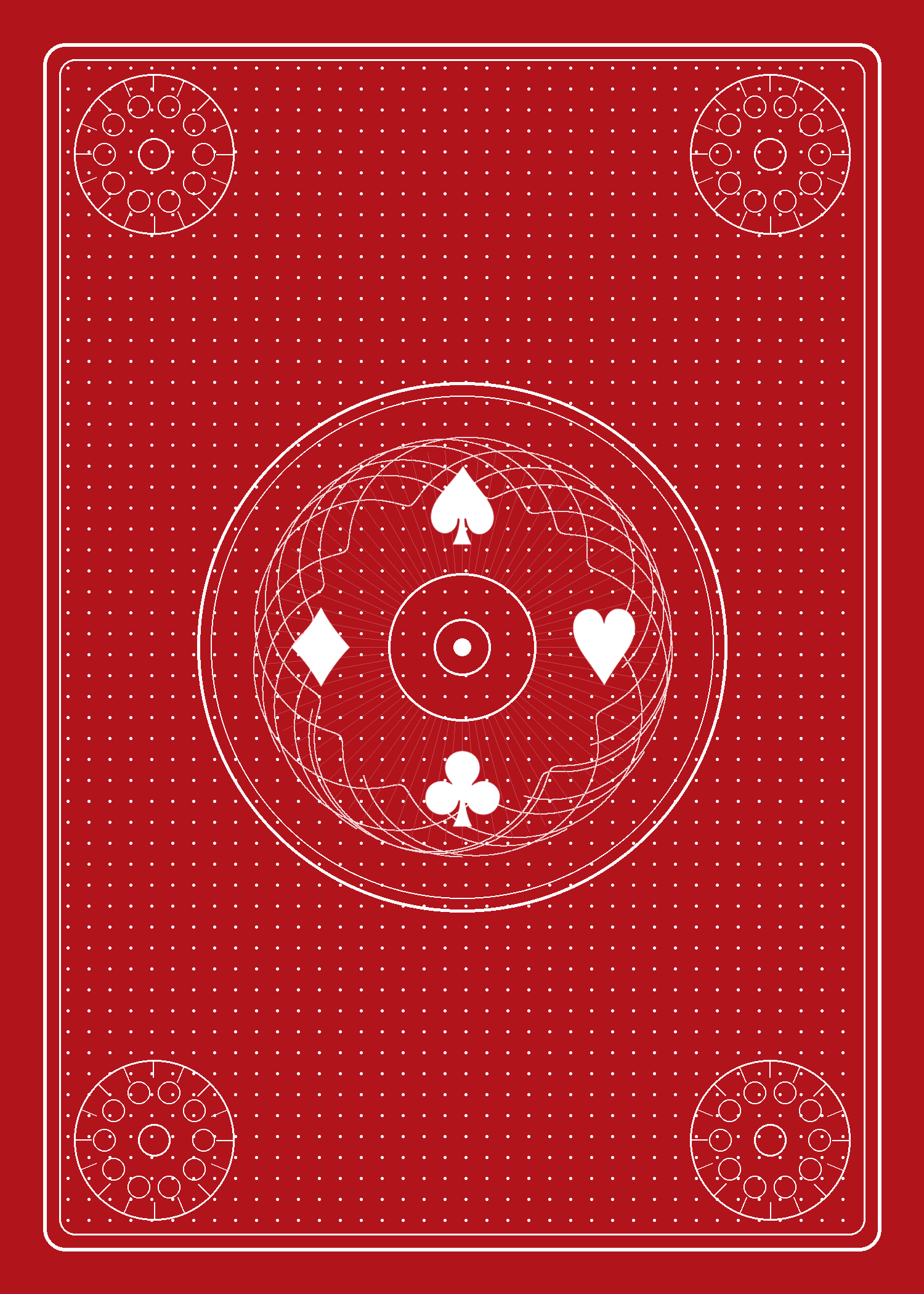
Fully original back design for the deck as a whole — single central medallion (not a twin-circle layout), guilloché rosette, four-suit compass at the center, corner rosettes, dot-field texture.
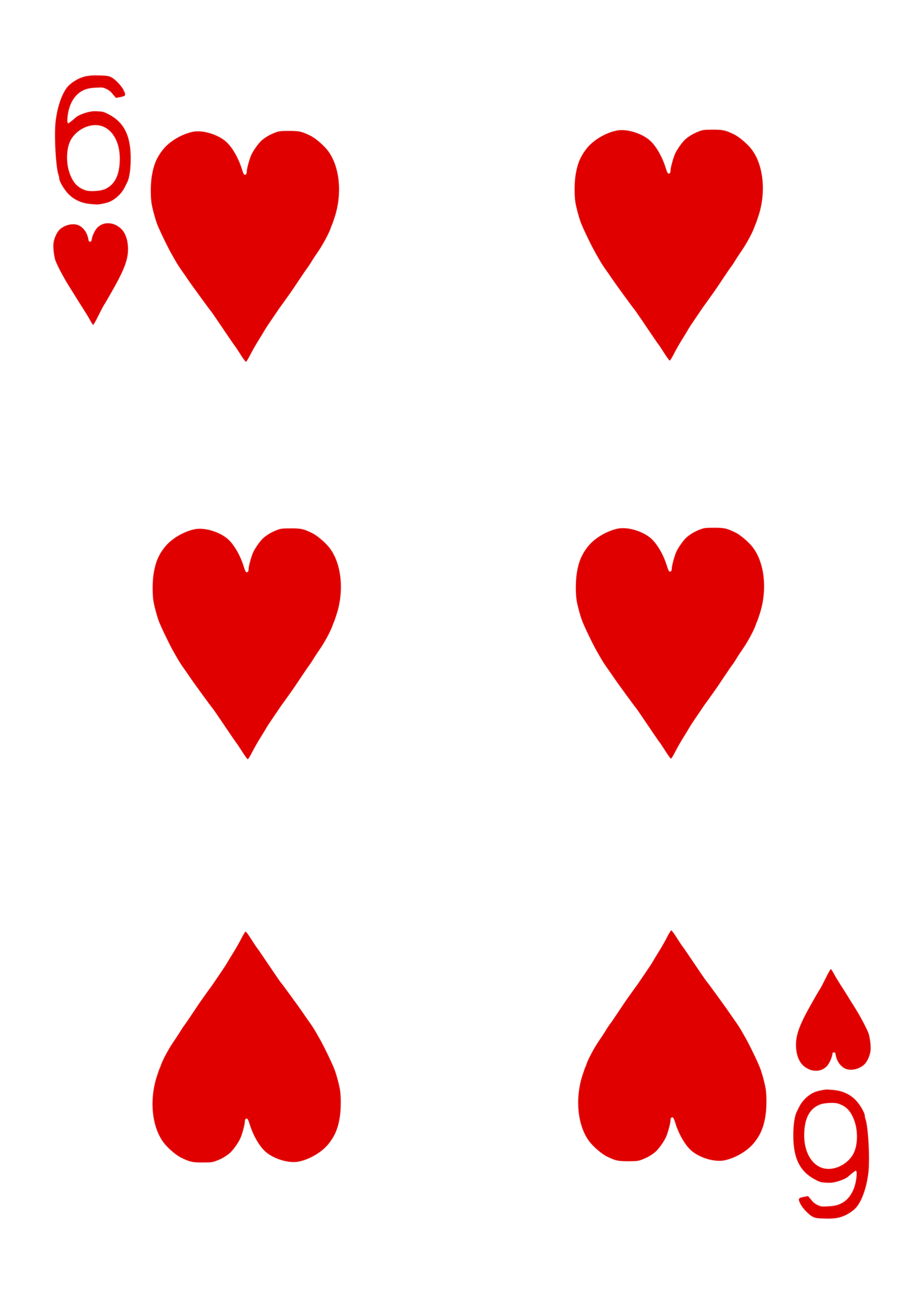
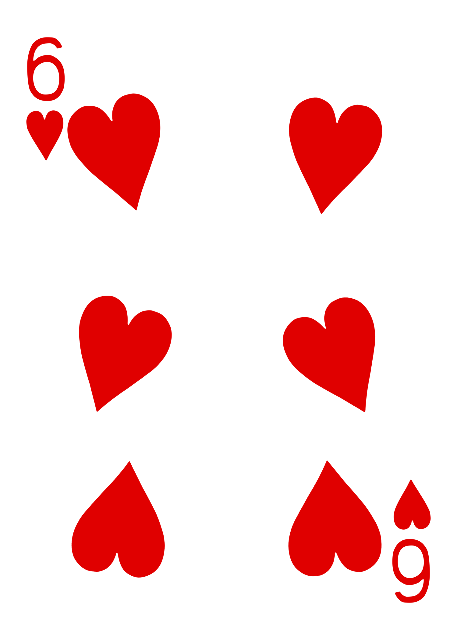
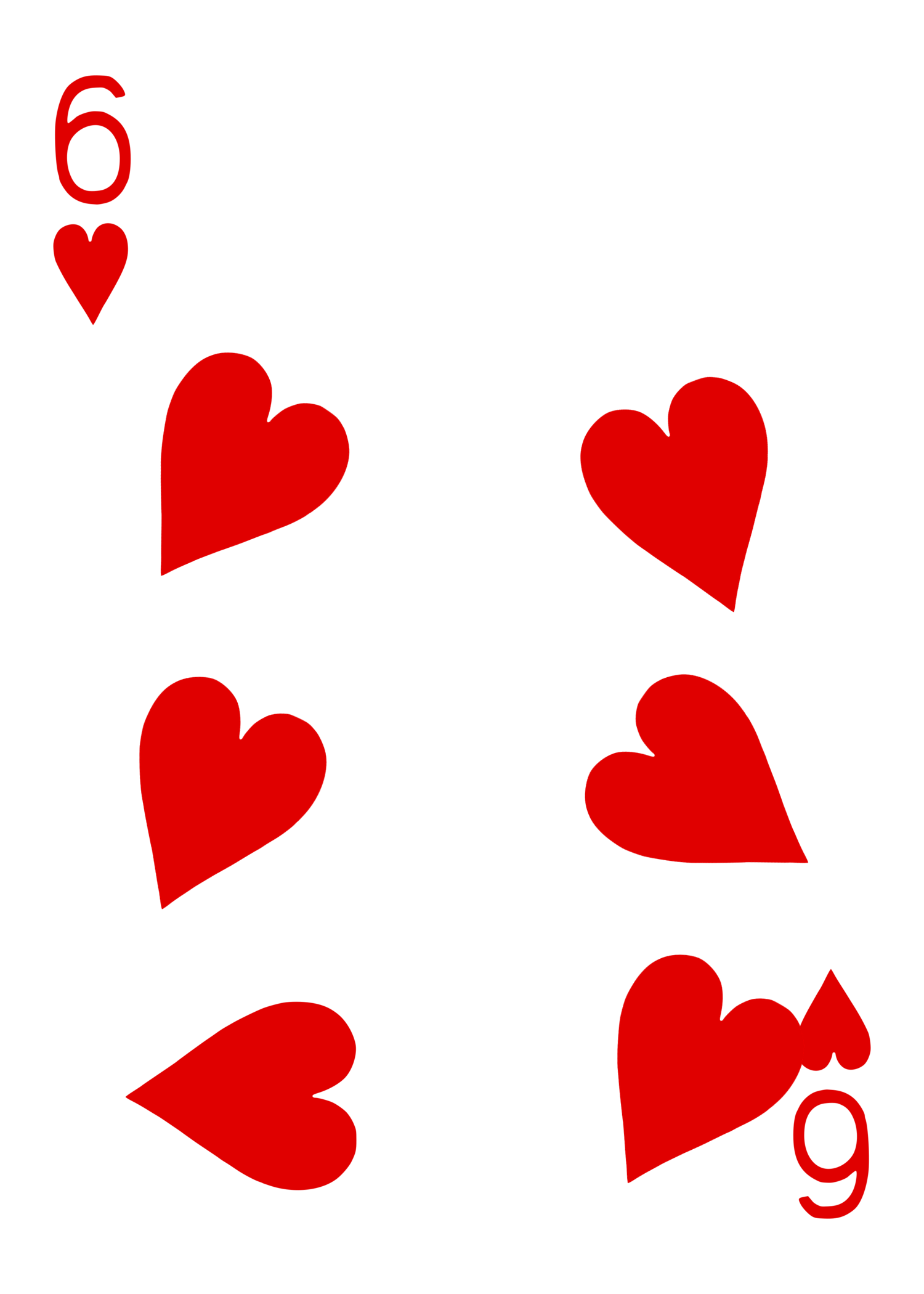
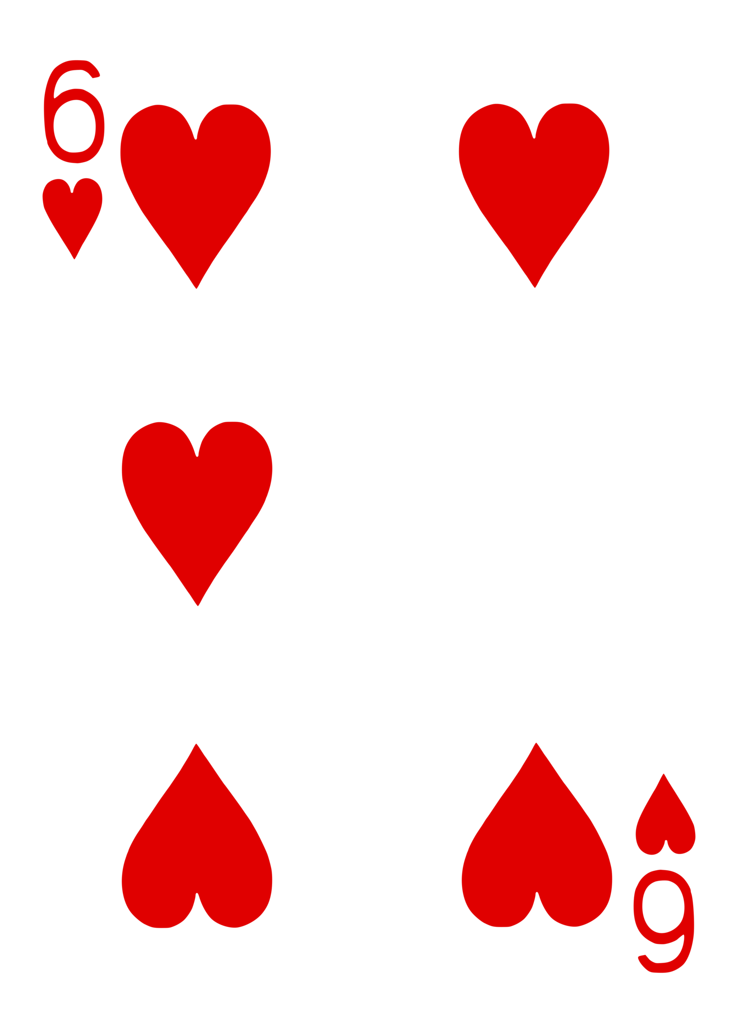
Standard 6♥ with the right-center pip simply omitted from the printed art — gives you a clean, pre-planned spot to physically tear so the card reads as damaged/restored mid-routine.
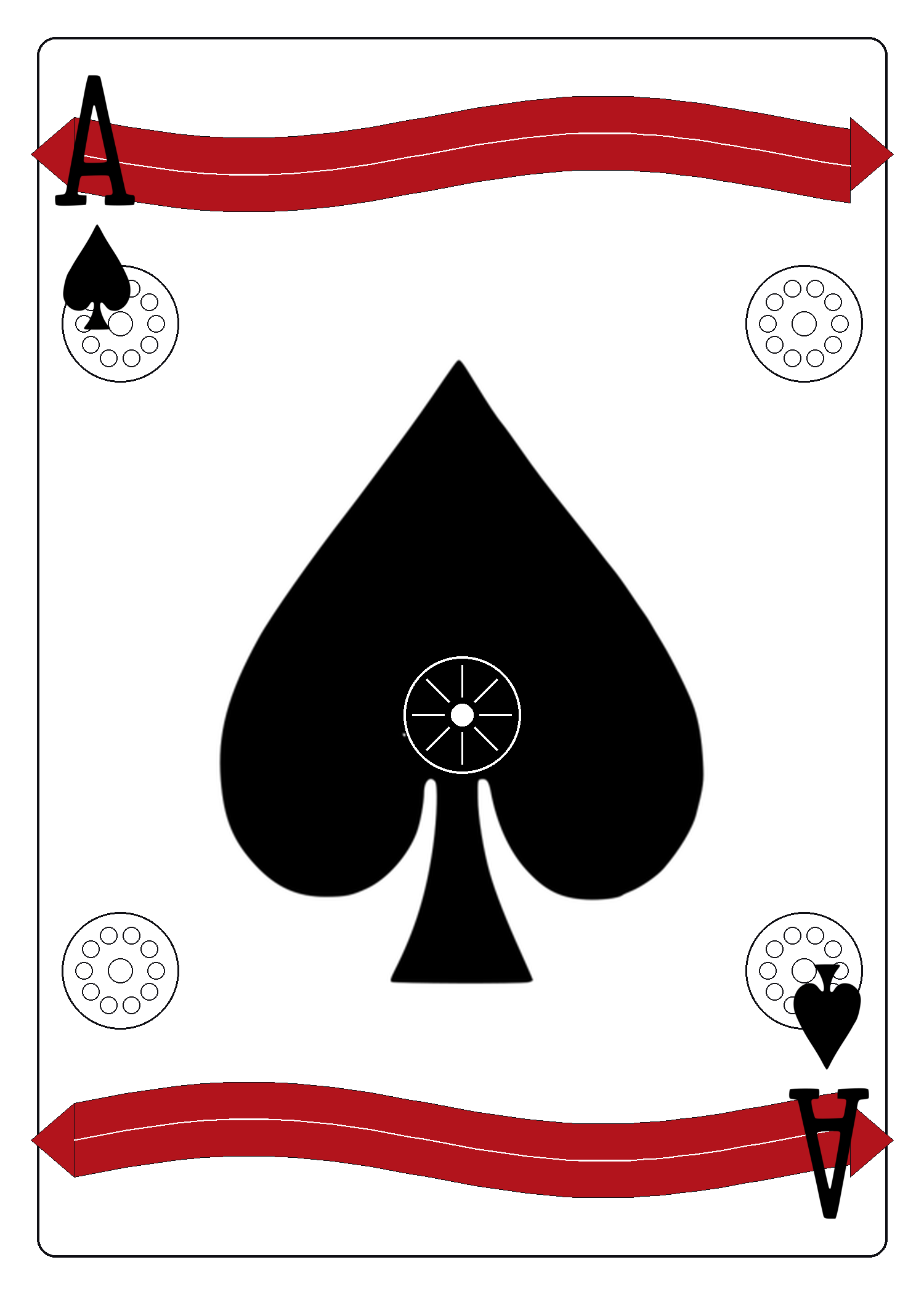
An original, fully custom-drawn alternative to the "fancy decorated Ace" treatment common in custom decks — bold central spade, arrow-tipped ribbon banners, corner rosettes matching the deck's back (card 17), and an abstract sunburst medallion in place of any illustrated figure.
Dot-size modulated by a travelling sine wave across the card.

Thick-pen diagonal crosshatch lattice with sparse solid ink diamonds running in diagonal streaks for visual weight — bold enough to read clearly from a few feet away.
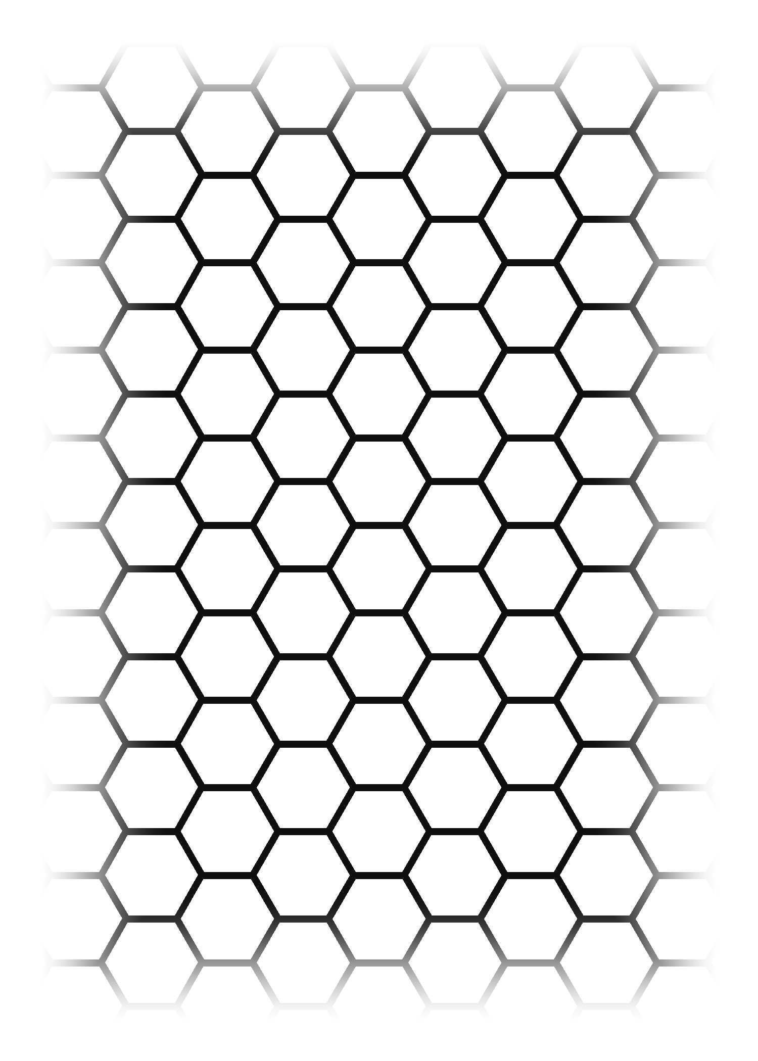
Blank-interior hexagons, bold solid stroke, tiled perfectly adjacent — each shared wall between neighboring cells is drawn exactly once (like collapsed table borders), so there's no doubled-up or uneven line weight anywhere in the mesh.
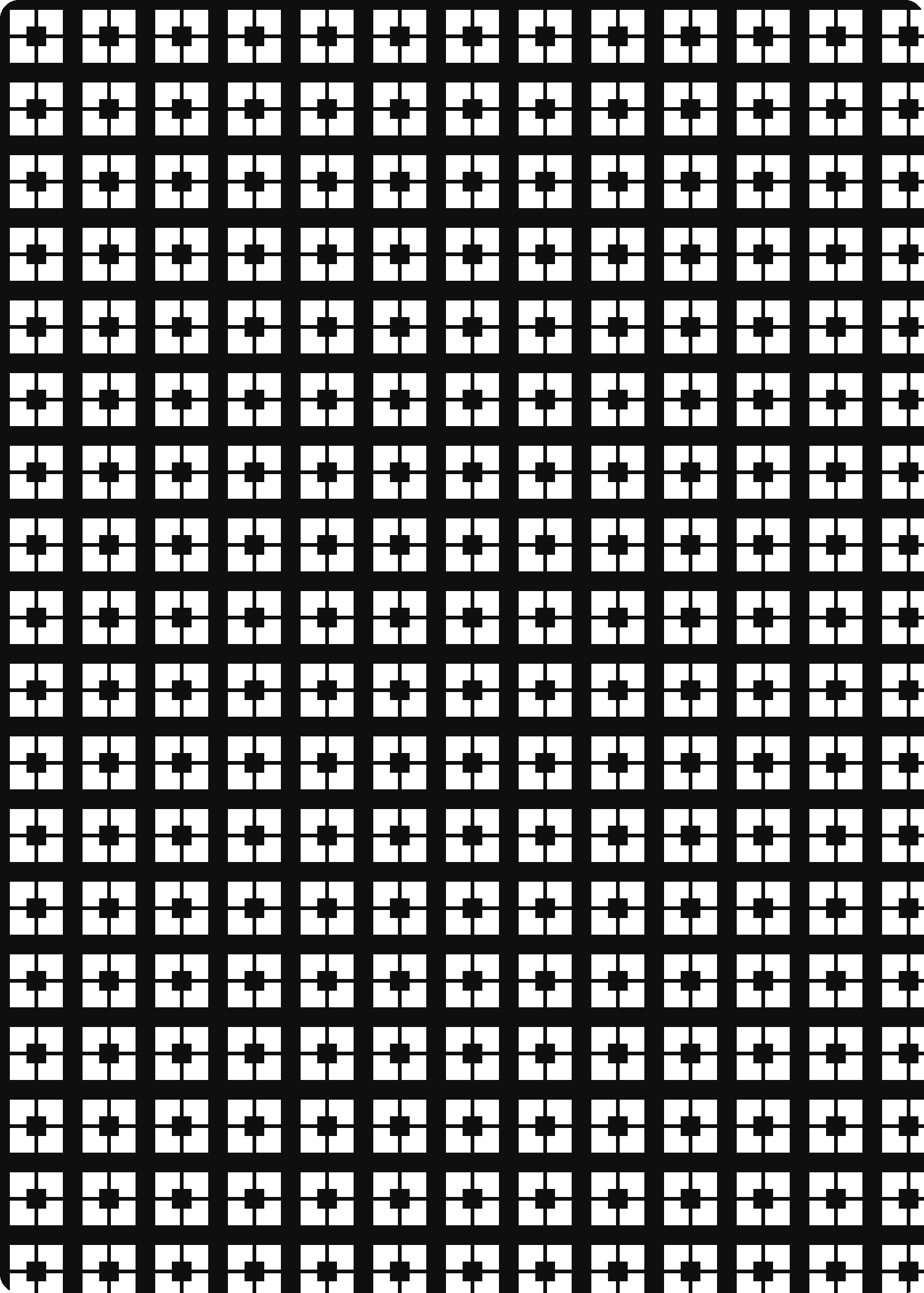
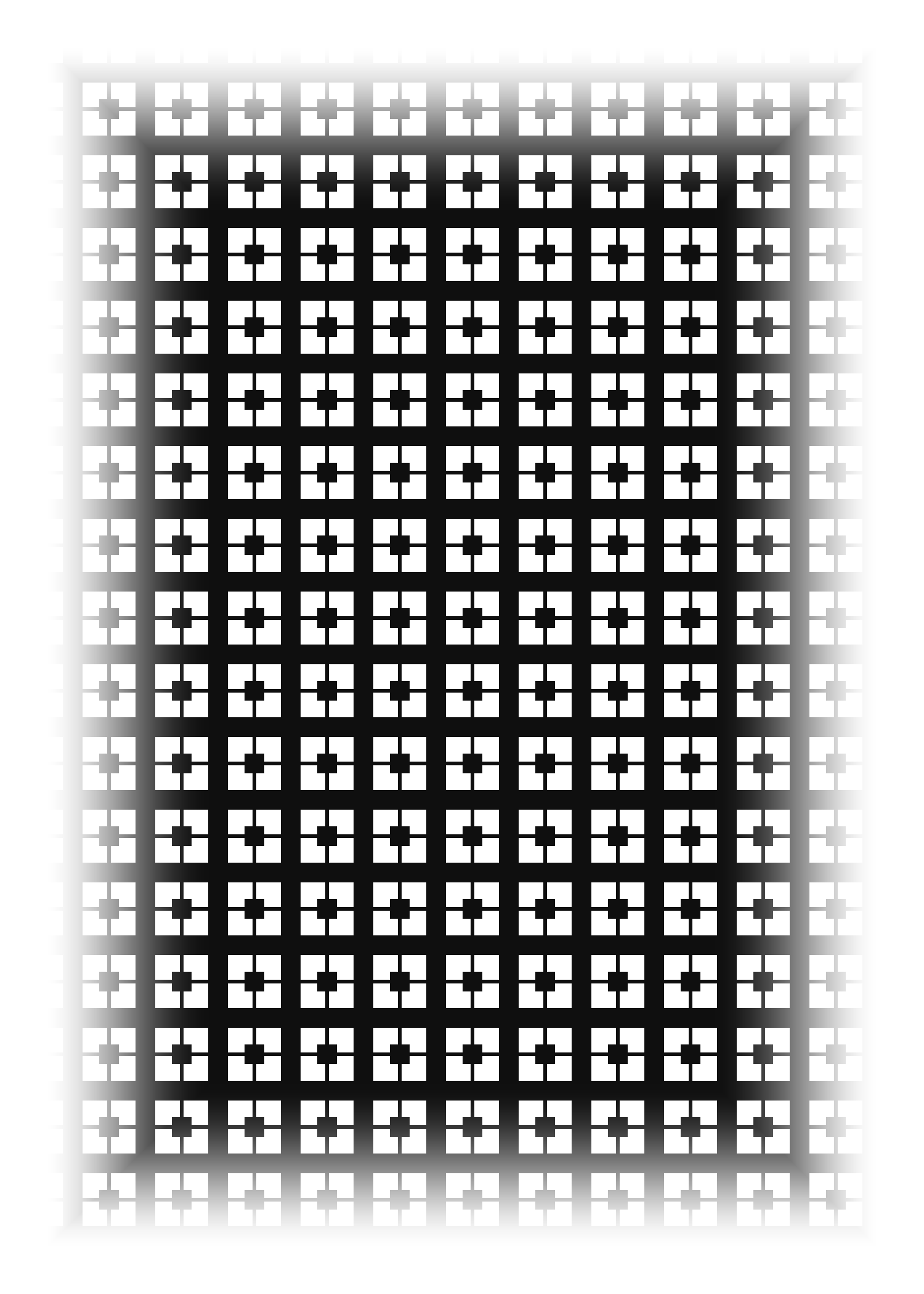
Inspired by mid-century concrete screen-block walls (a generic, decades-old architectural motif, not any specific trademarked design) — a grid of solid square cells, each with an interlocking pinwheel cutout, like perforated concrete masonry.
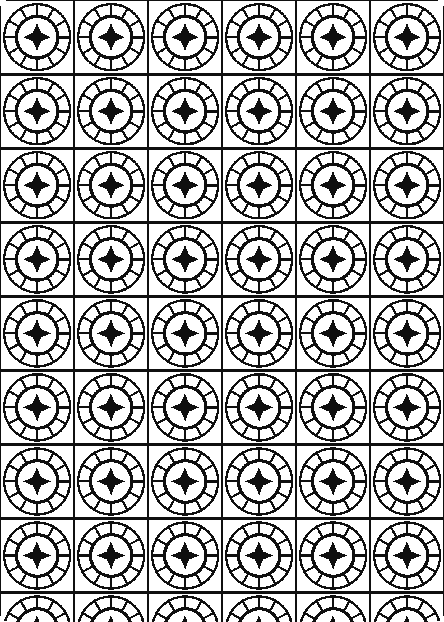
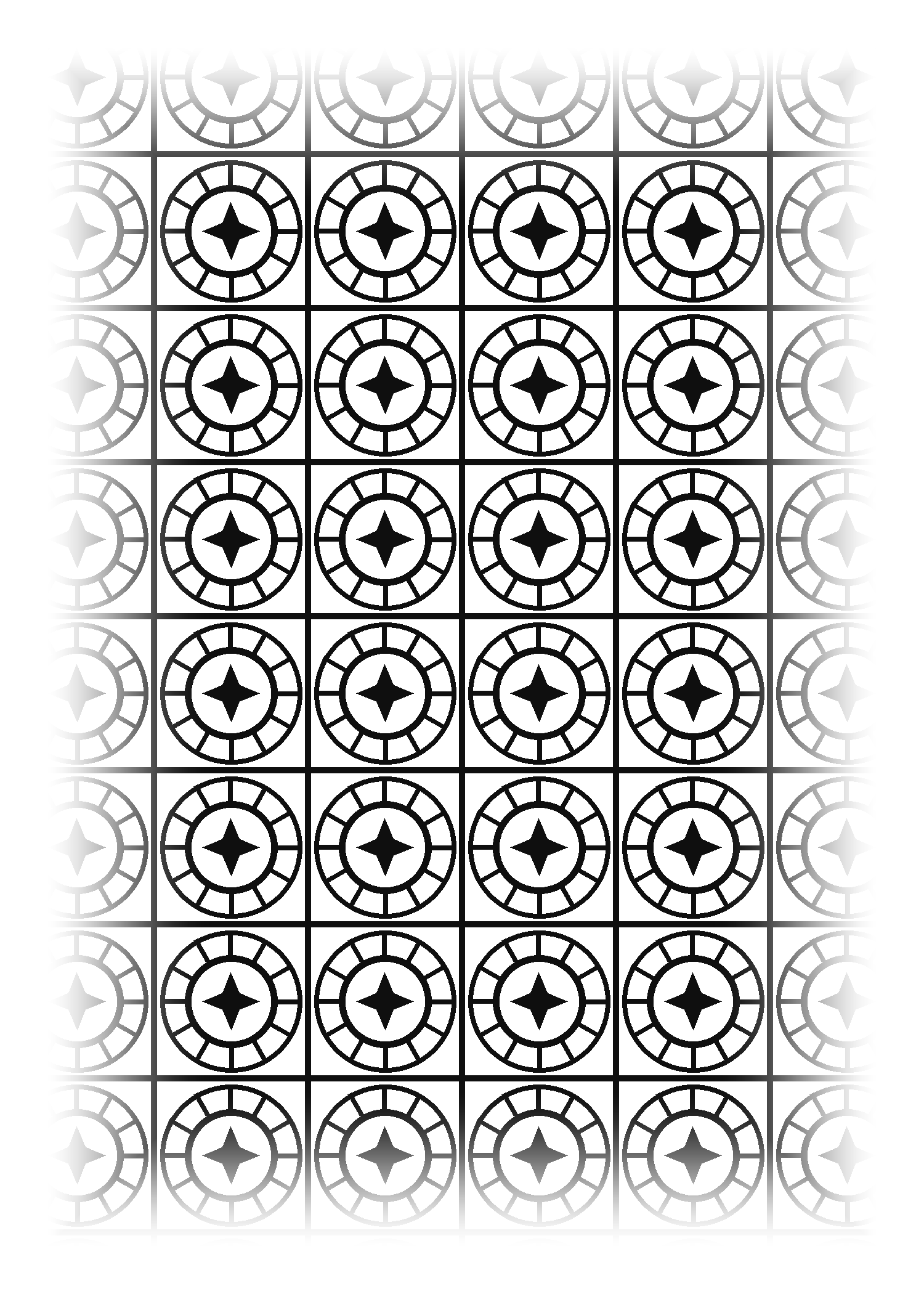
Inspired by the general composition of ornate tiled bronze door panels (square panel grid, each with a circular sunburst medallion) — original center emblem (an abstract star, not any specific heraldic figure), bold lines sized to read clearly in print.
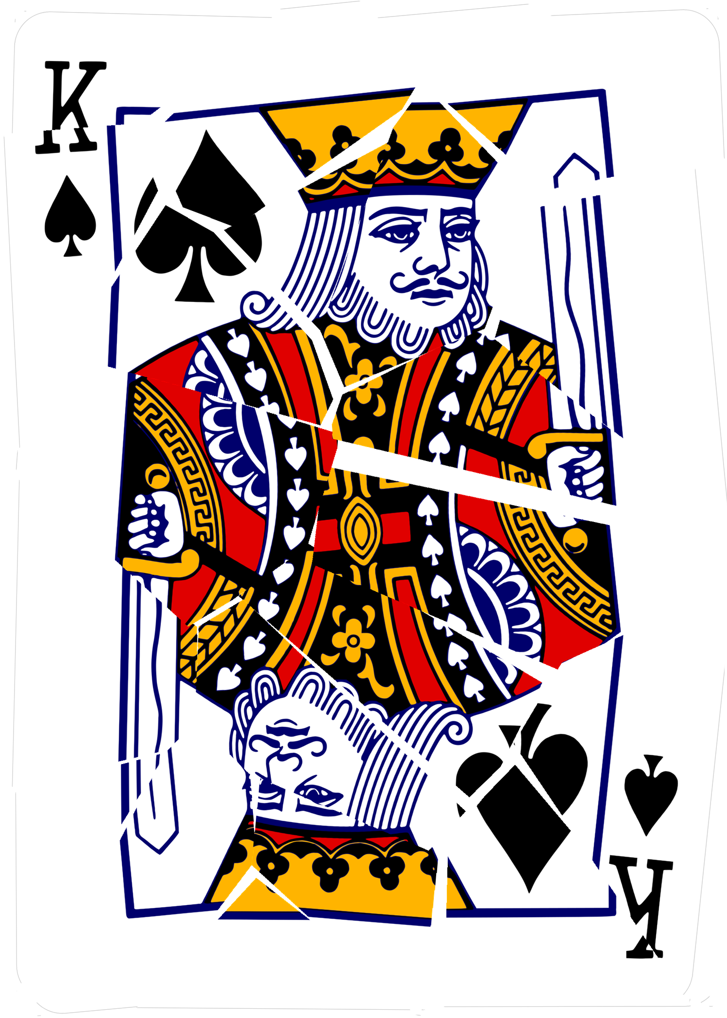
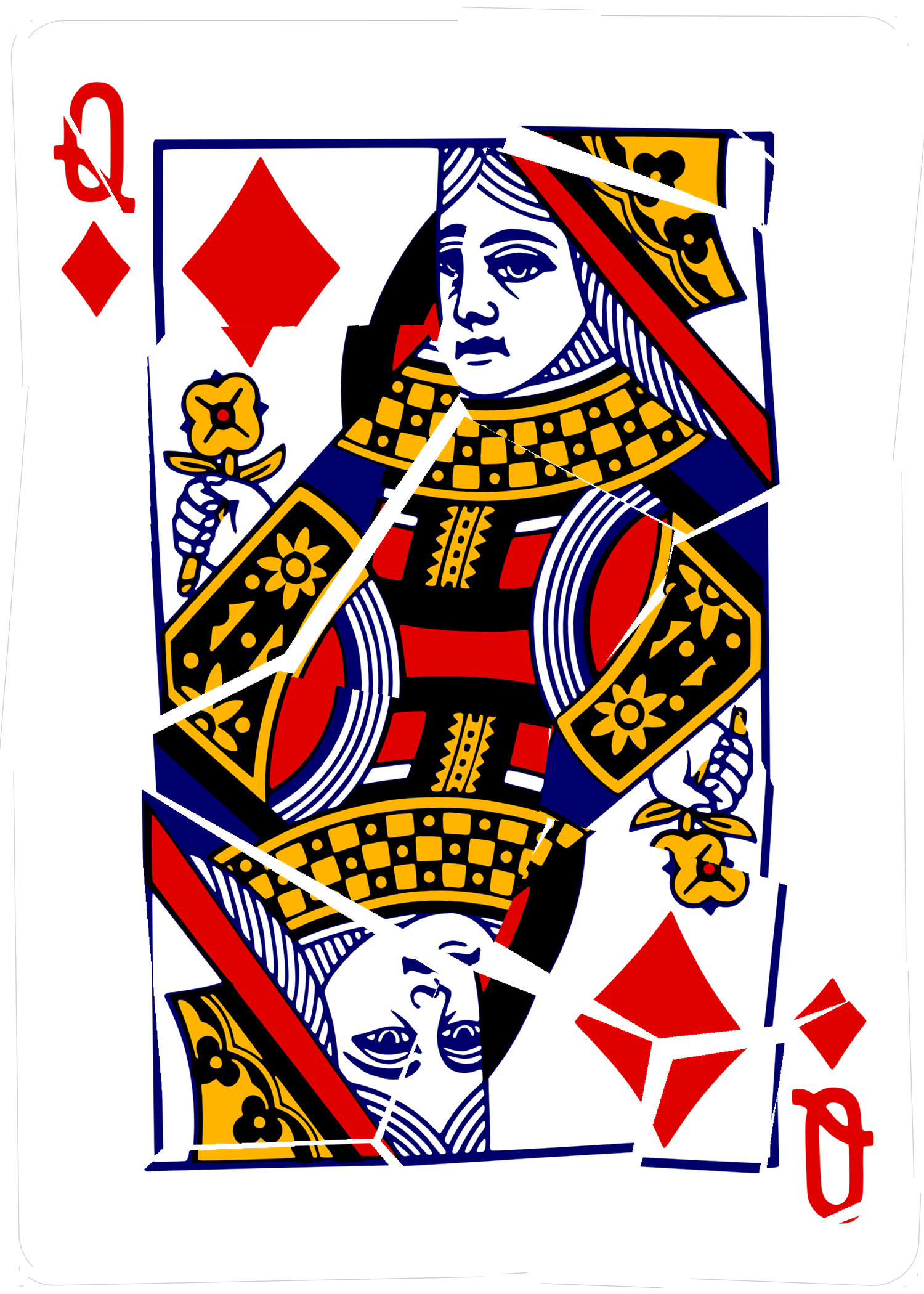
Same Voronoi-fracture effect as 36–37, applied to the whole face-card illustration instead of just a pip — the card reads as physically cracked glass/ceramic.
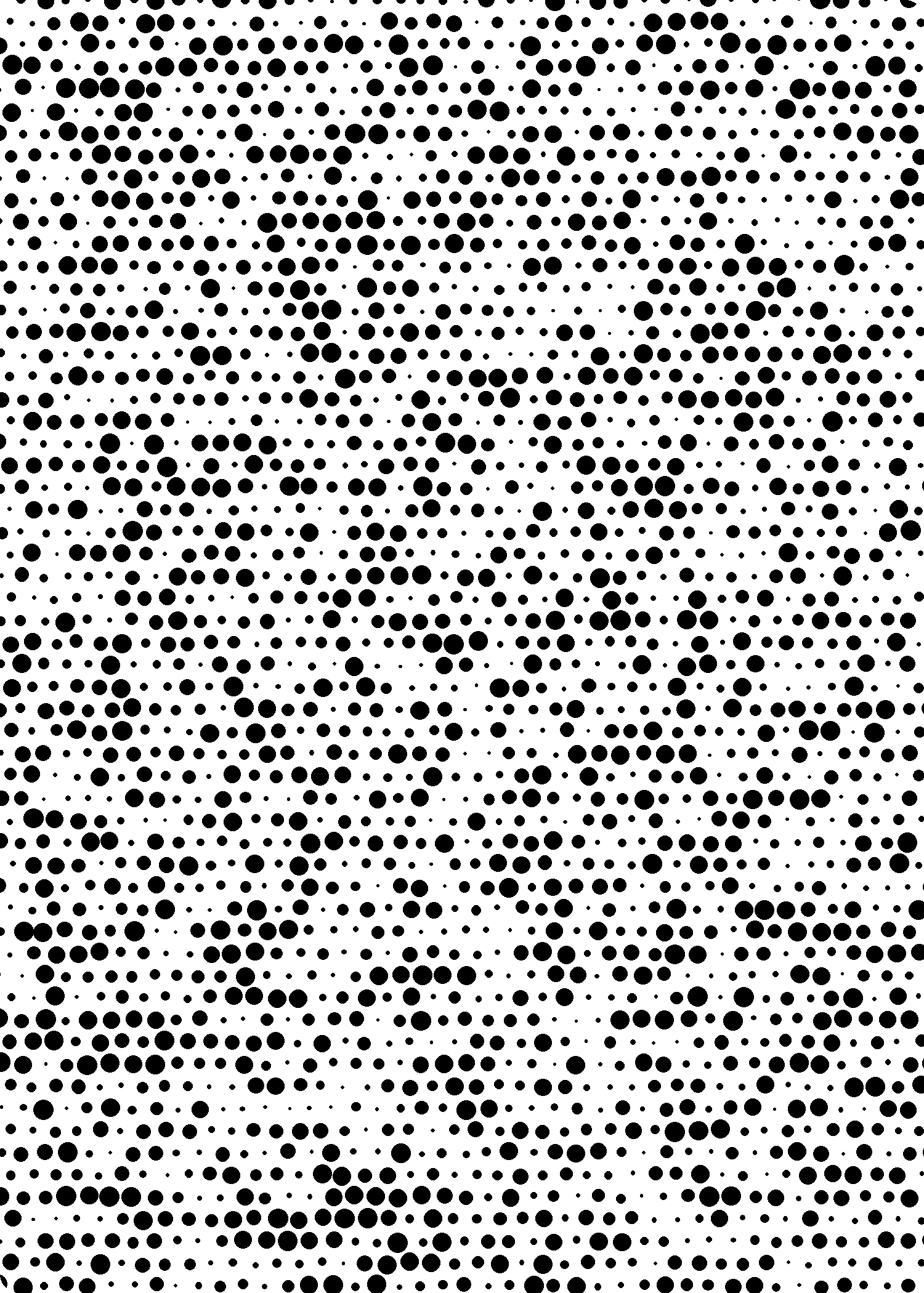
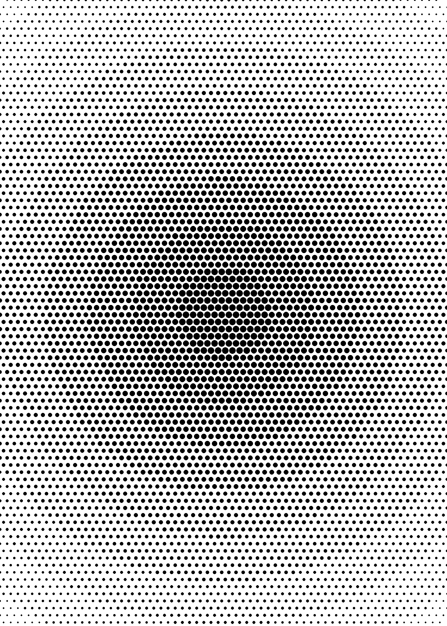
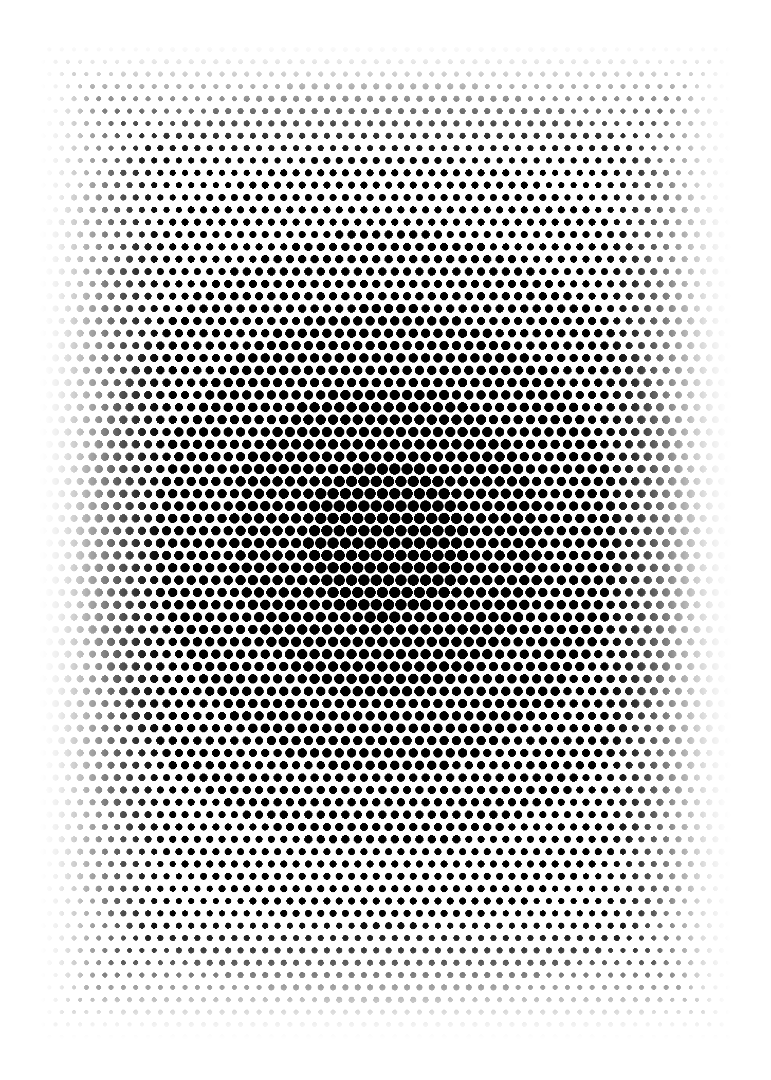
More variations on the dot-size-modulation idea from 40–41, but "solid" (full dense coverage, no travelling wave bands) — each uses a different rule for how dot size varies across the card. 47: radial, largest at center fading to small at the rim. 48: randomly jittered size per dot for an organic stippled texture. 49: smooth large-to-small gradient along the diagonal.


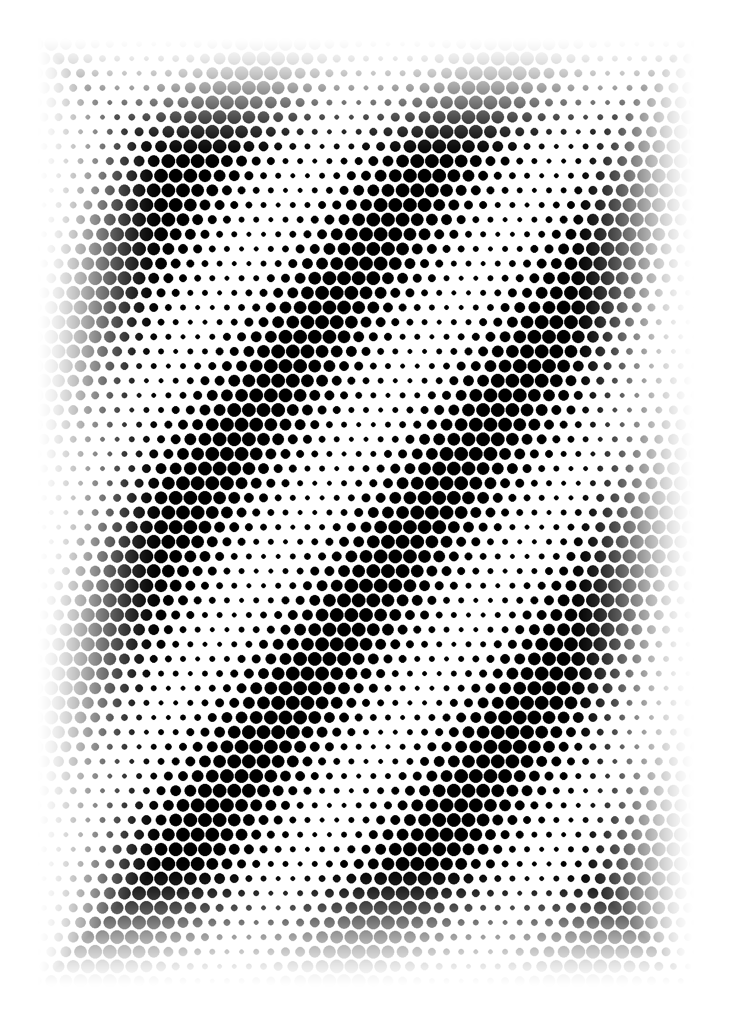
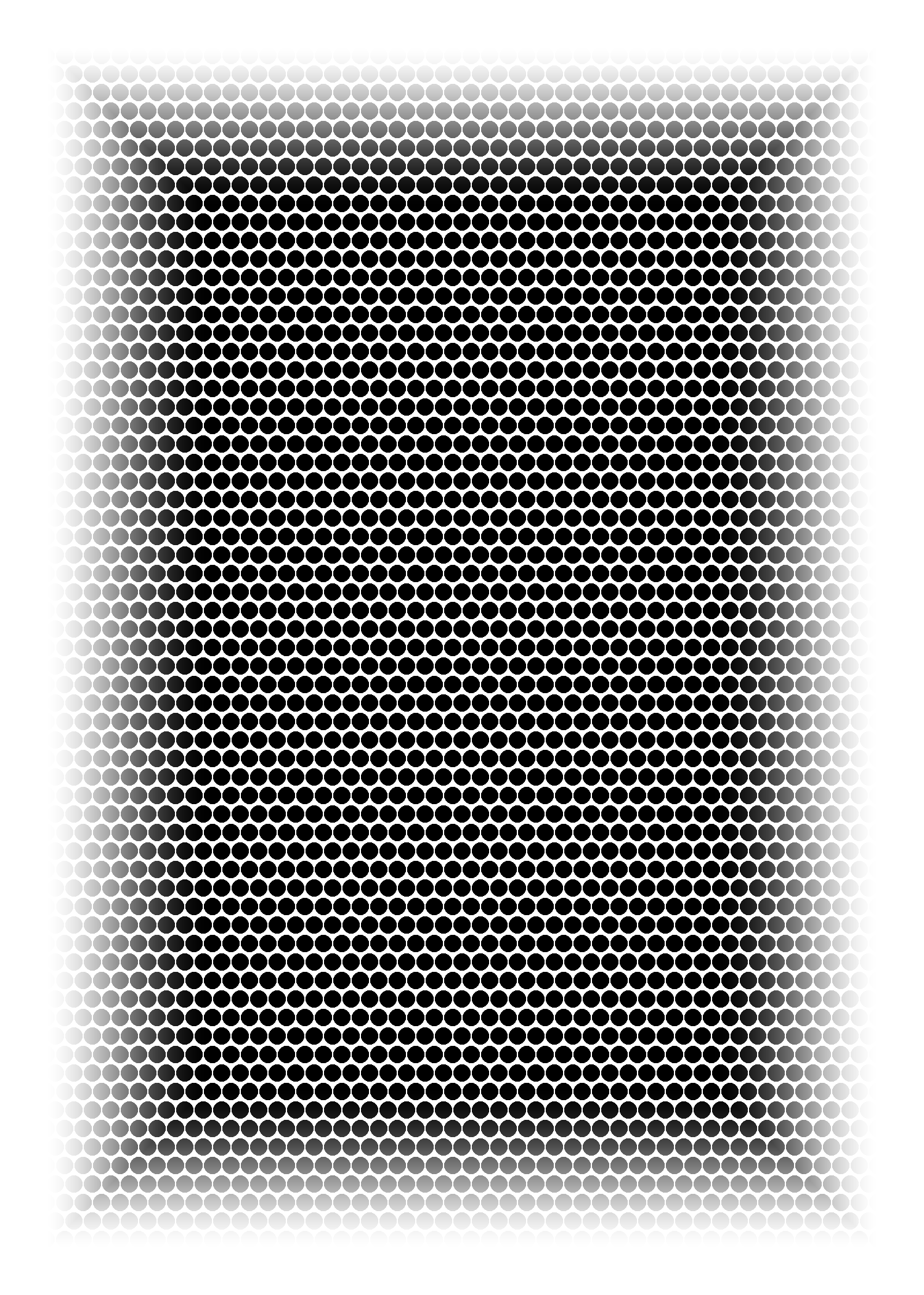
Pushed the halftone idea darker per your note: wave and radial versions now swing from near-solid black (dots large enough to overlap and fully merge) down to a medium gray rather than light/white — plus a flat "evenly dark" variant with no wave or radial modulation at all, just a consistent dense dot mesh. The radial version's center is now deep black from dots actually touching/overlapping (tighter packing), not just bigger dots on a sparse grid.


Two aging treatments applied to both a number card and a face card: a neutral "distressed" pass (cracked/flaking ink, worn edges, no color shift) and a warmer "aged + distressed" pass (sepia discoloration, mottled stains, vignette, worn ink) for comparison.
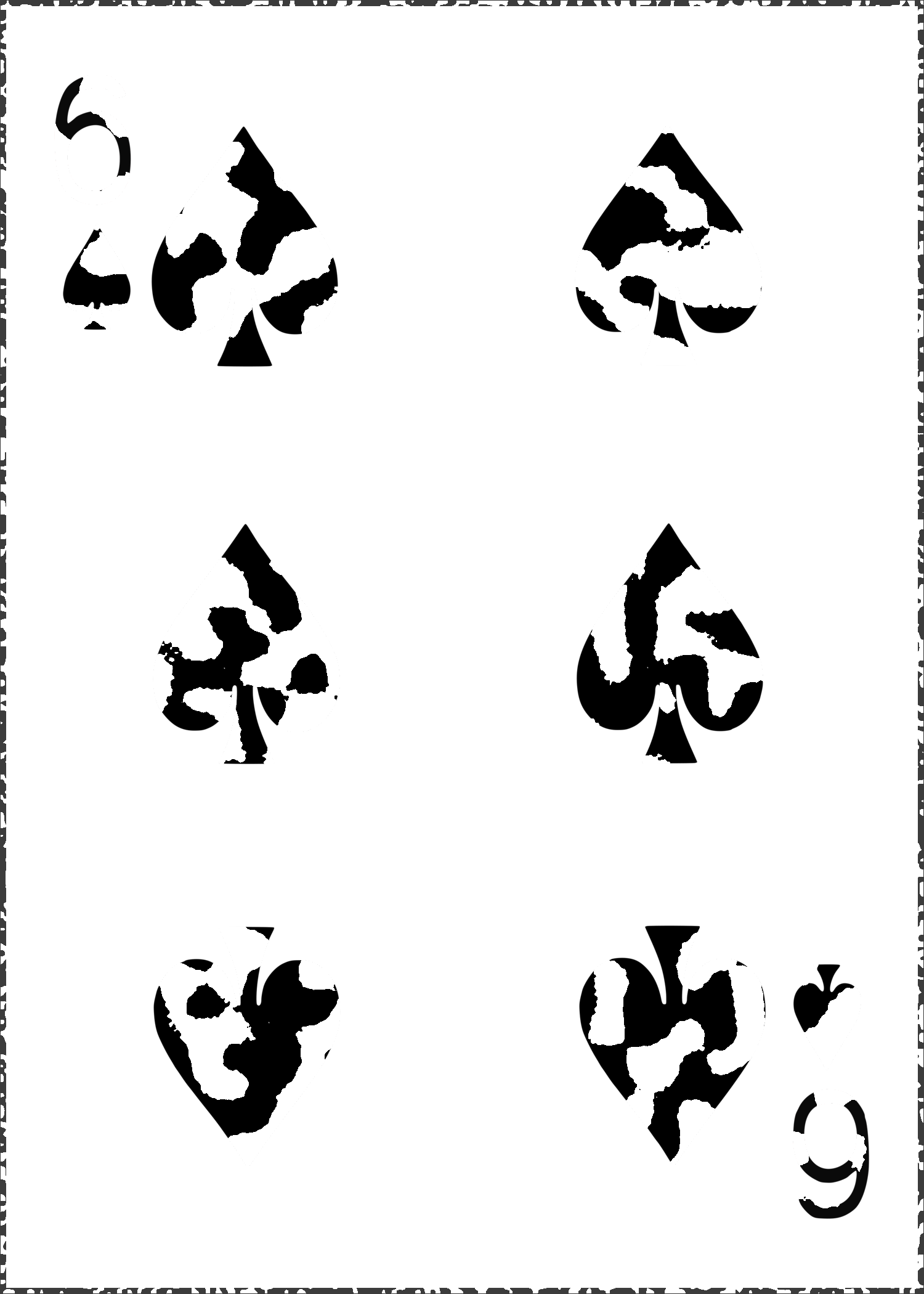
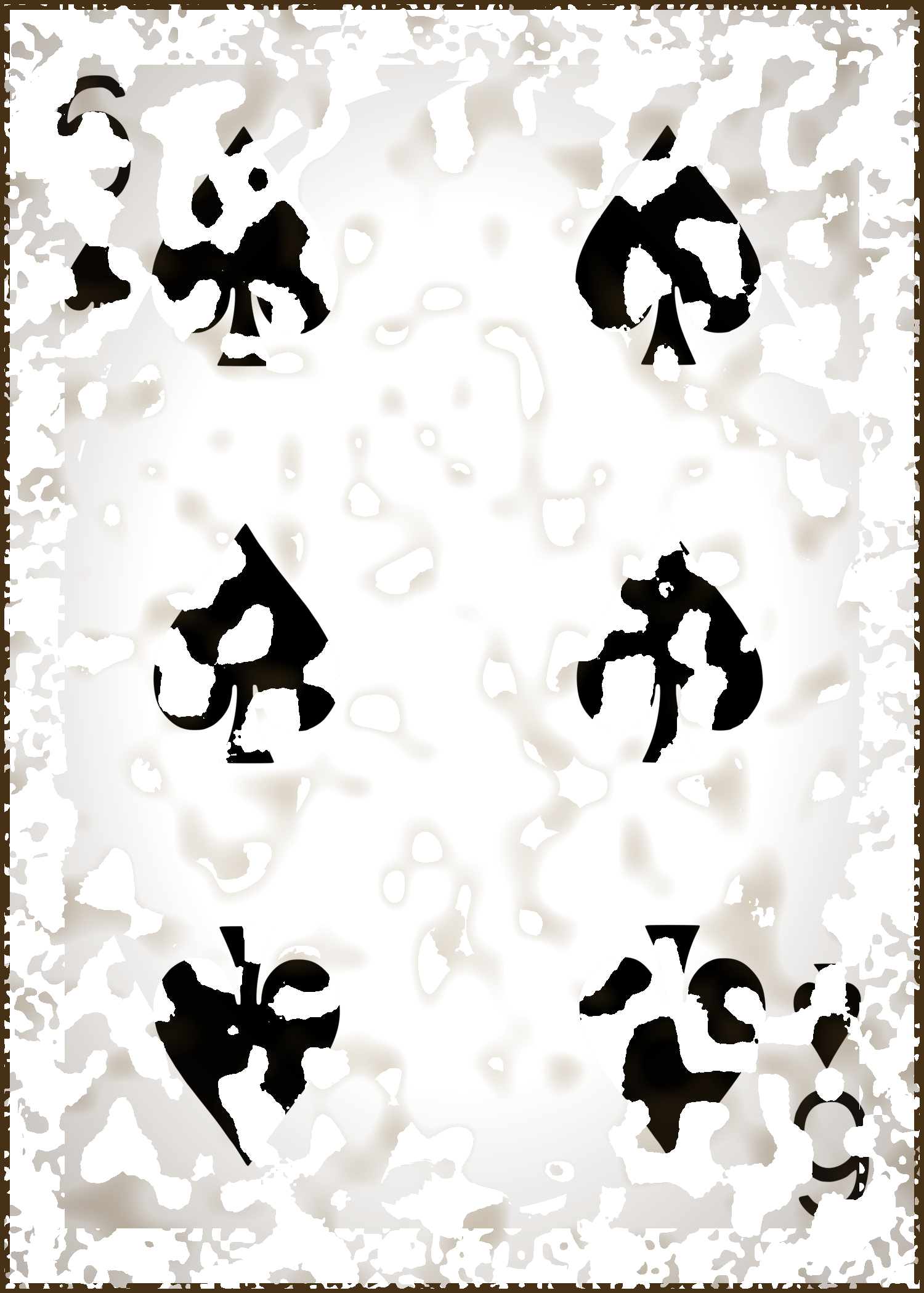
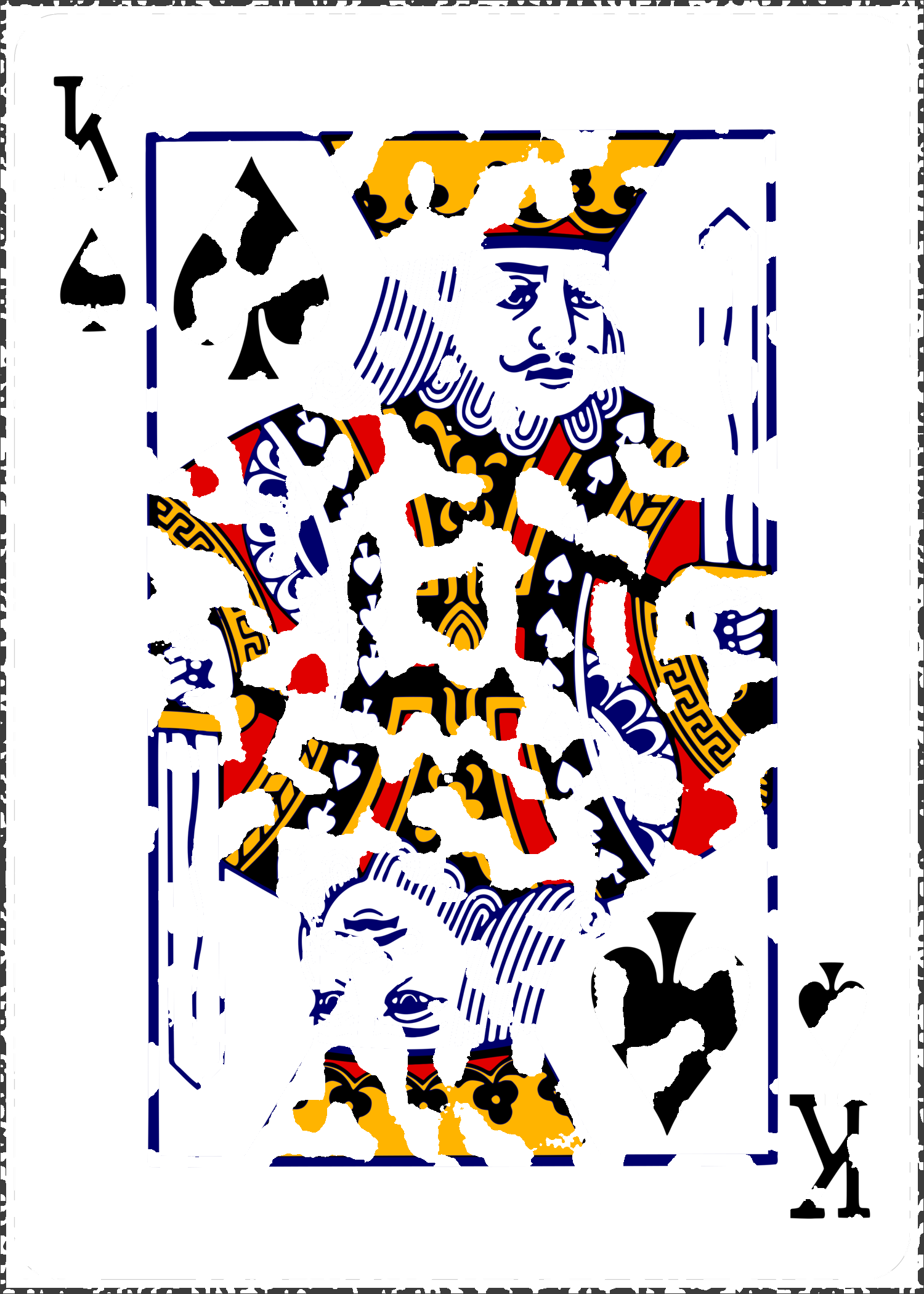
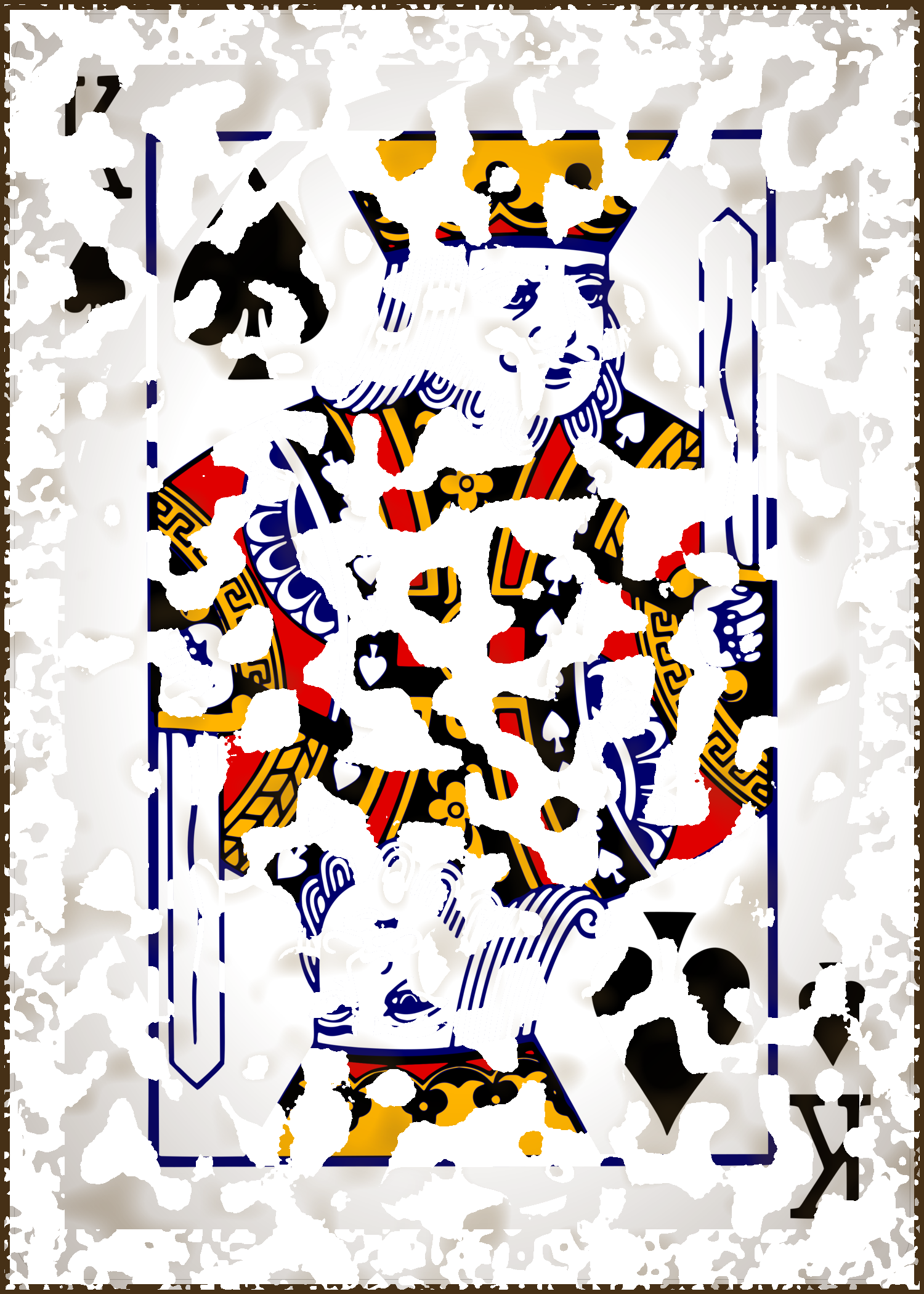
Pips dissolve into a soft upward smoke-trail across the set rather than changing color or position — a "vanish" flourish set.
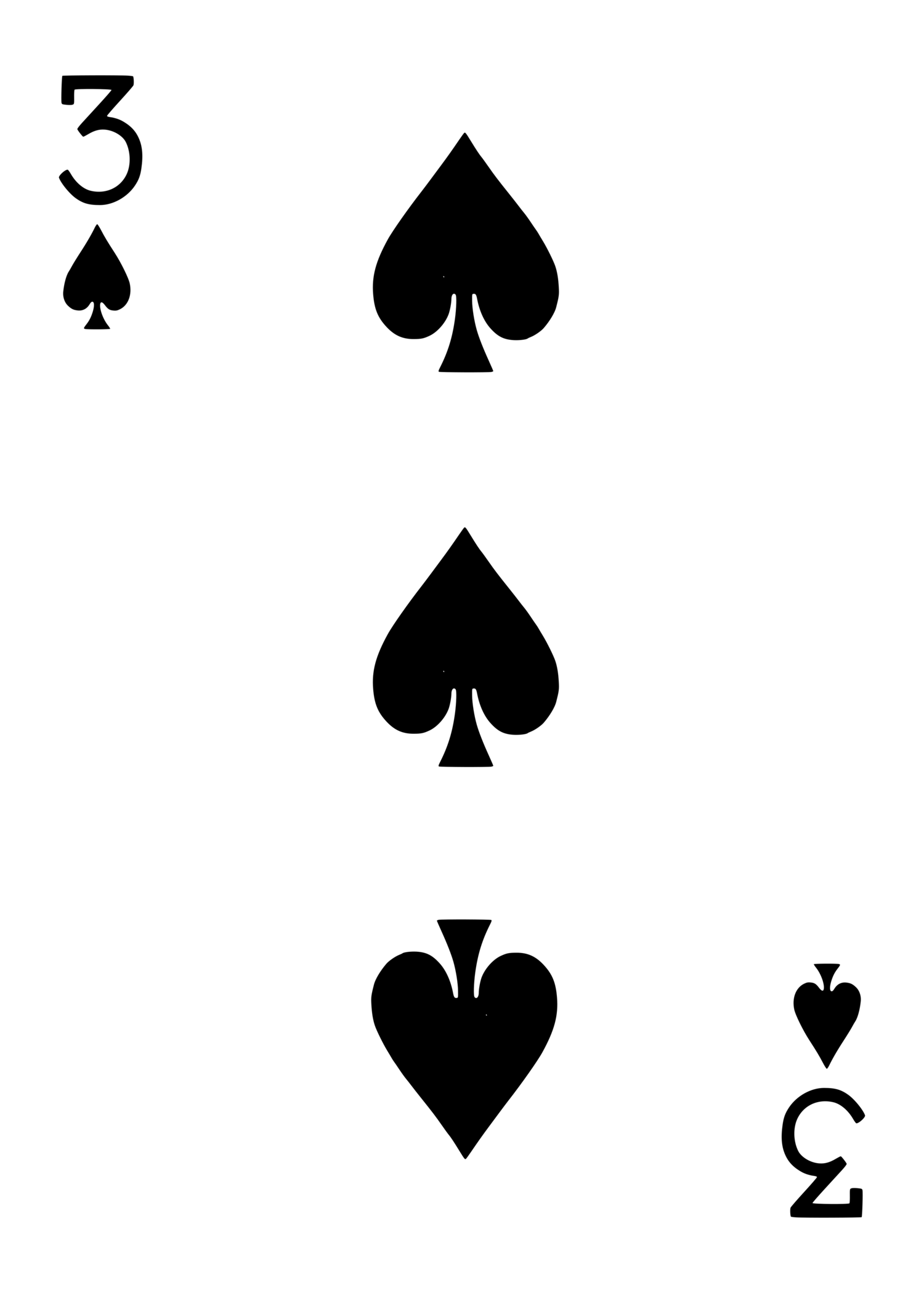
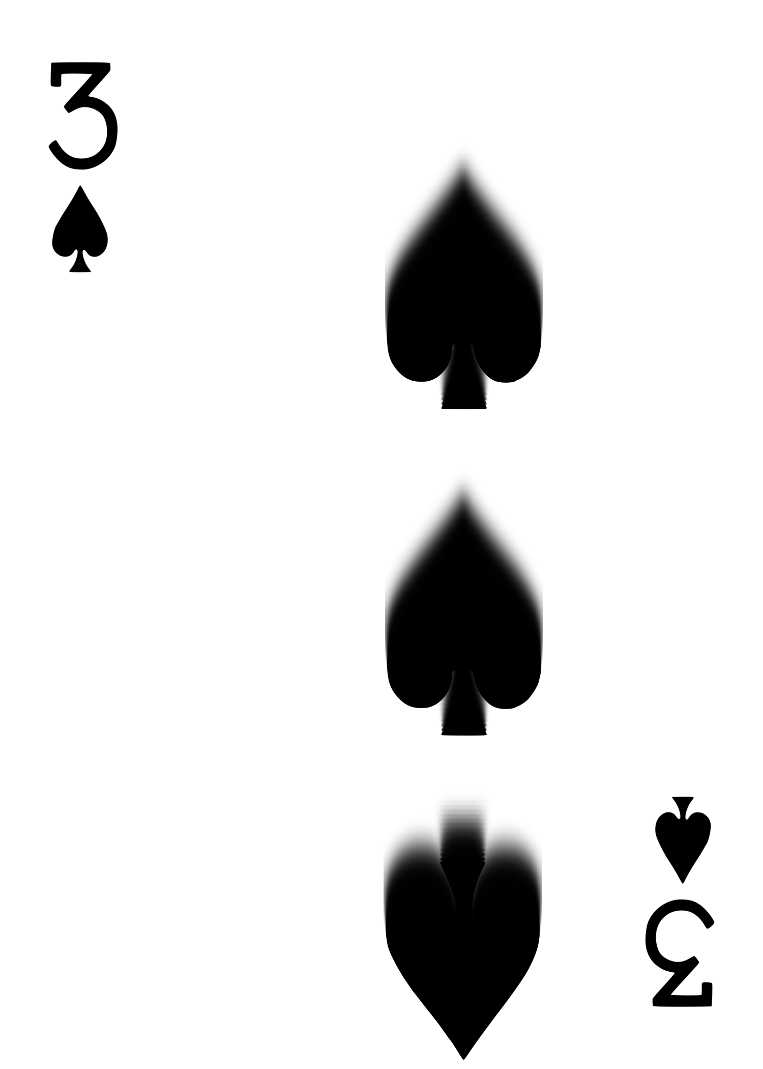
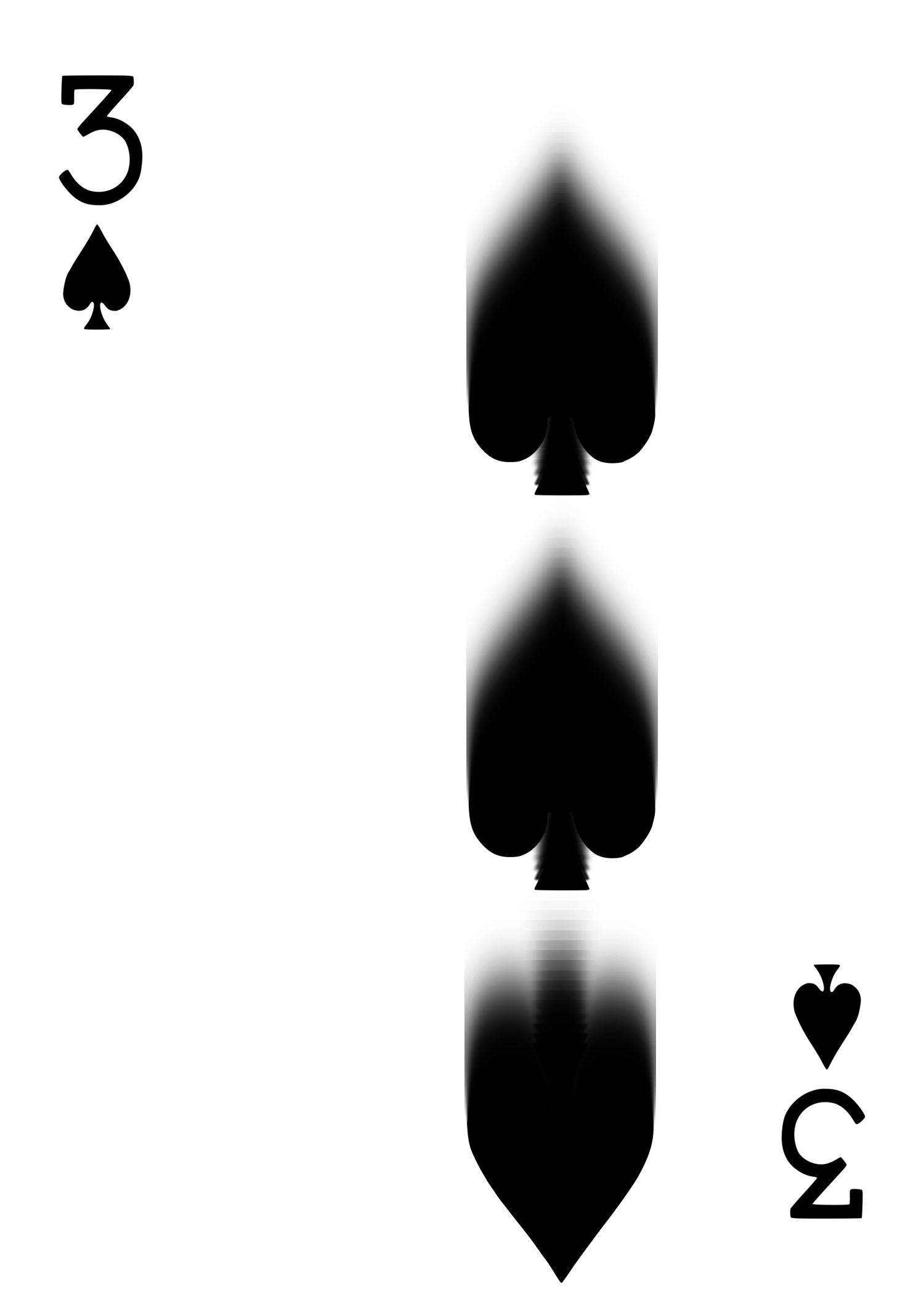
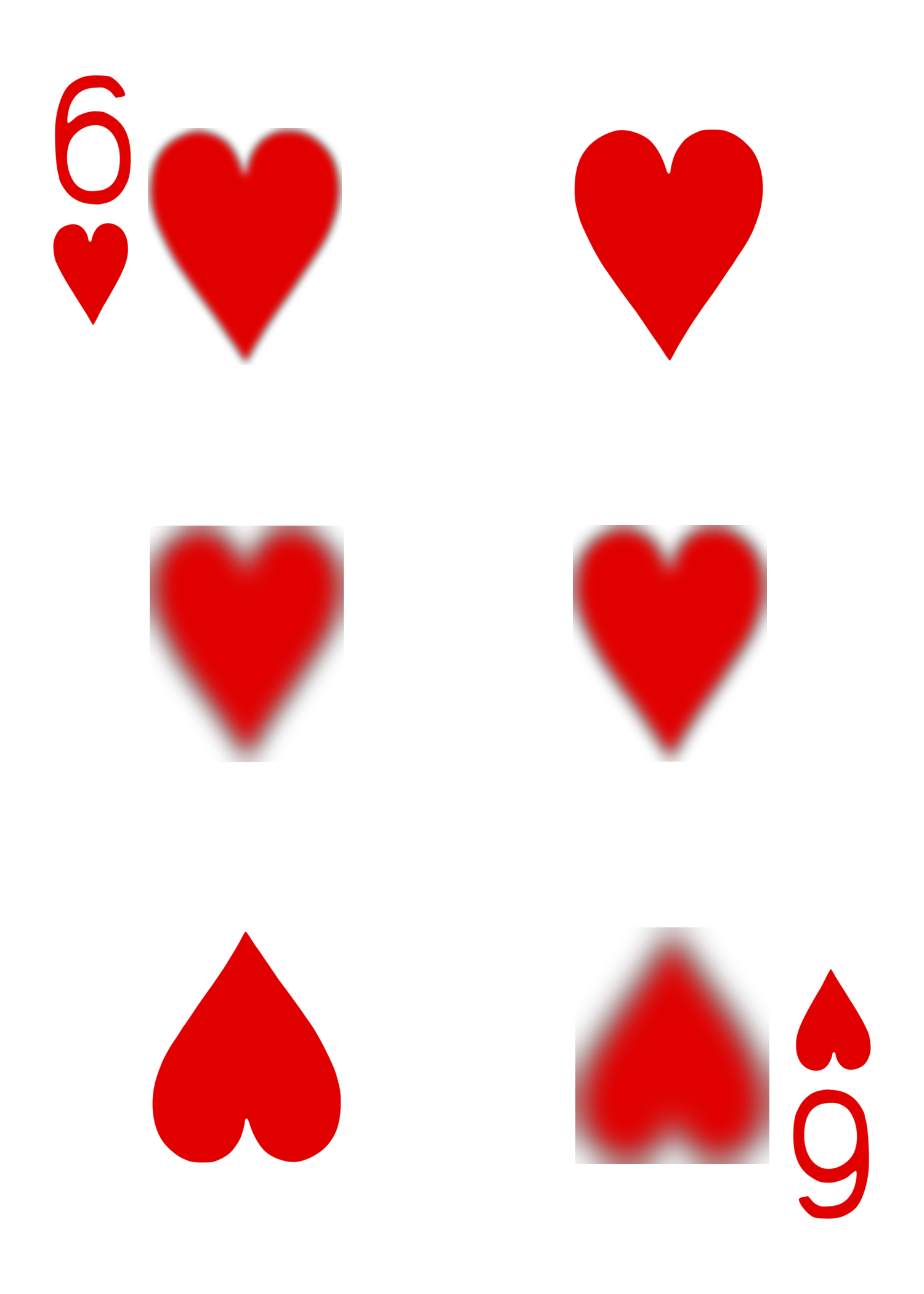
Individual pips rendered with varying Gaussian blur on the same card — a few sharp, a few soft — for a selective-focus look.
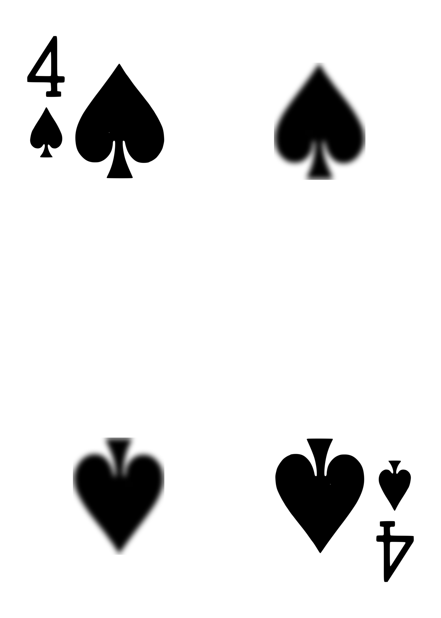
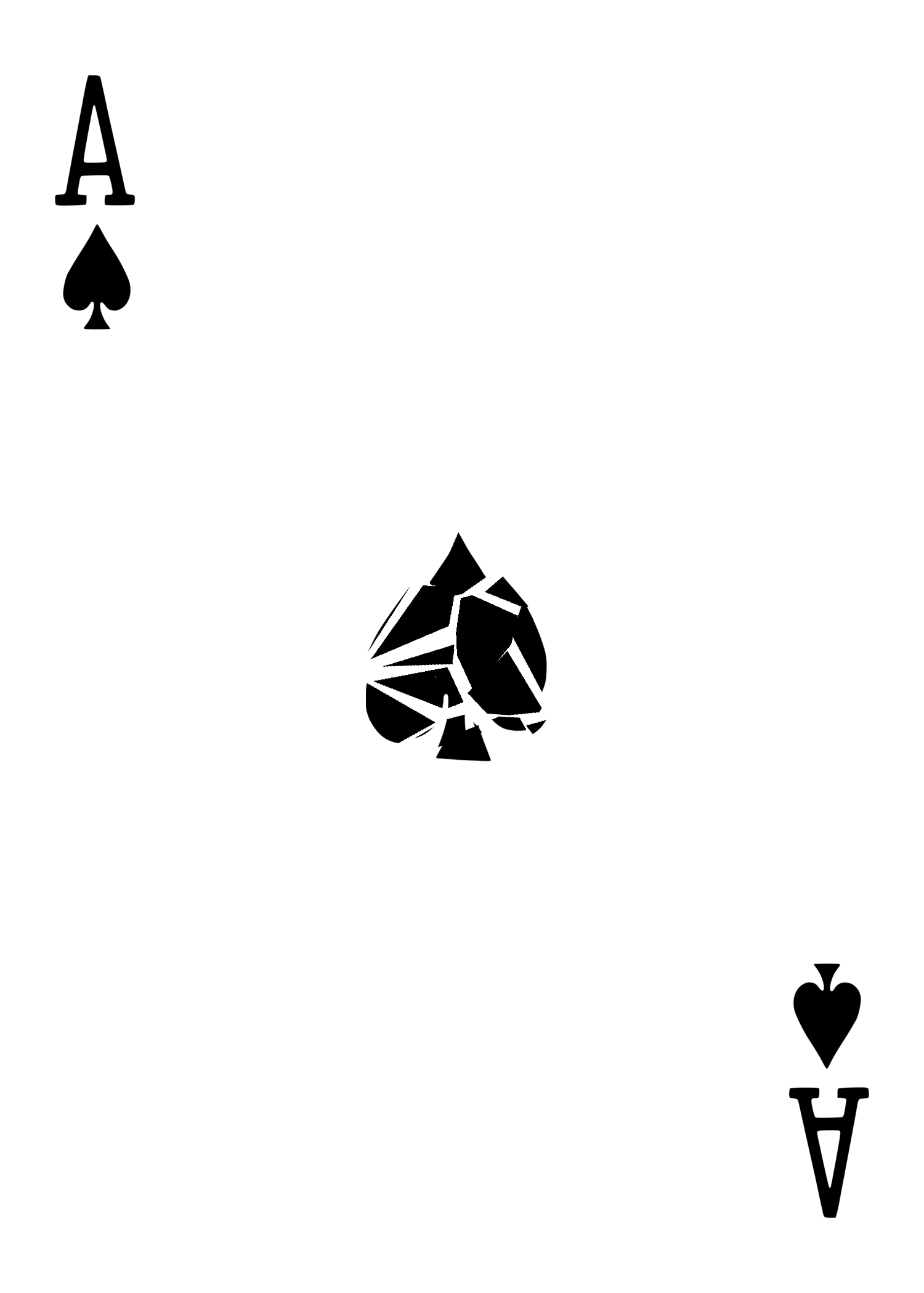
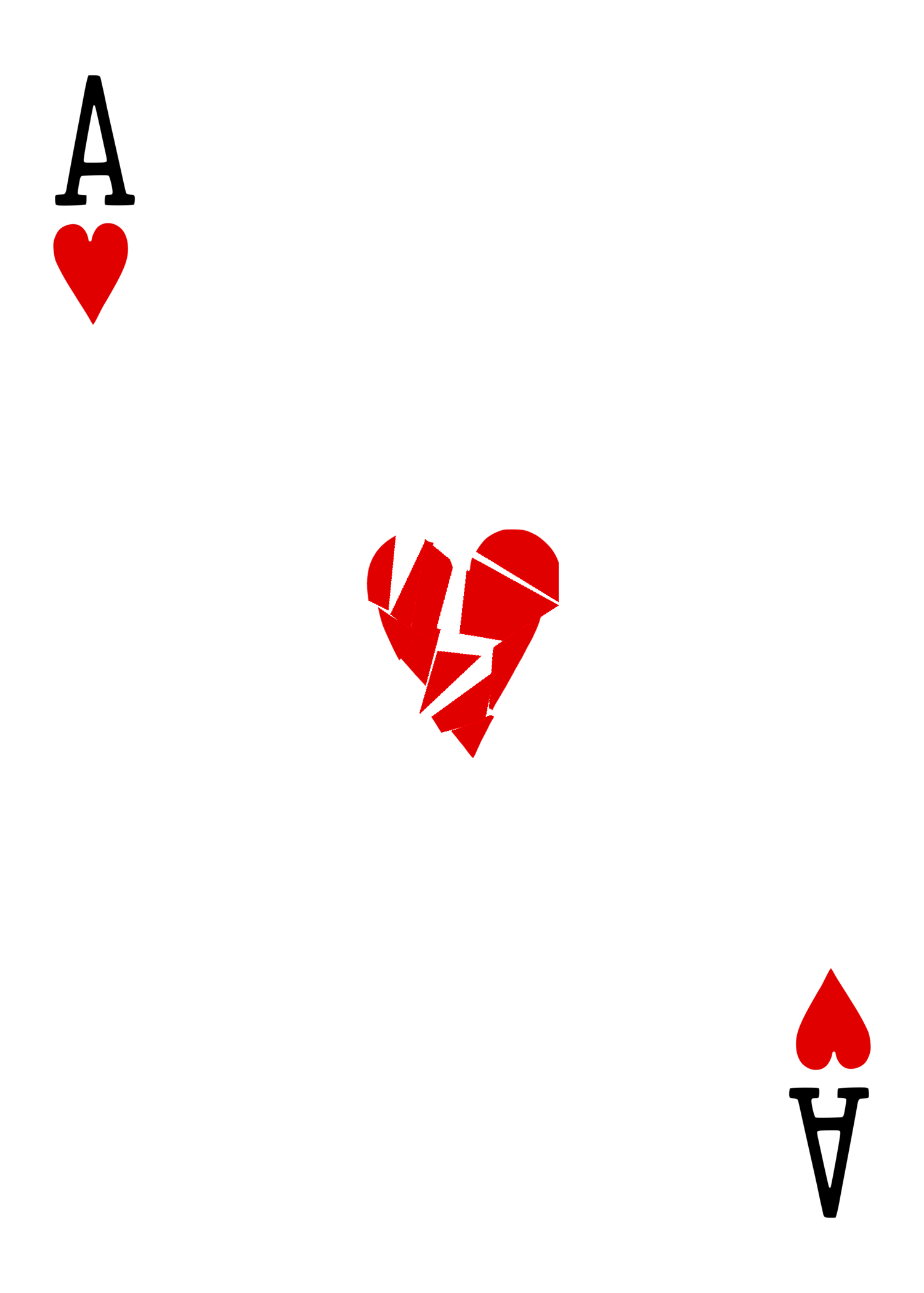
A single pip fractured into offset glass-shard shapes (Voronoi-based fracture with small gaps and jitter) — a "broken/CSI" style gag card.
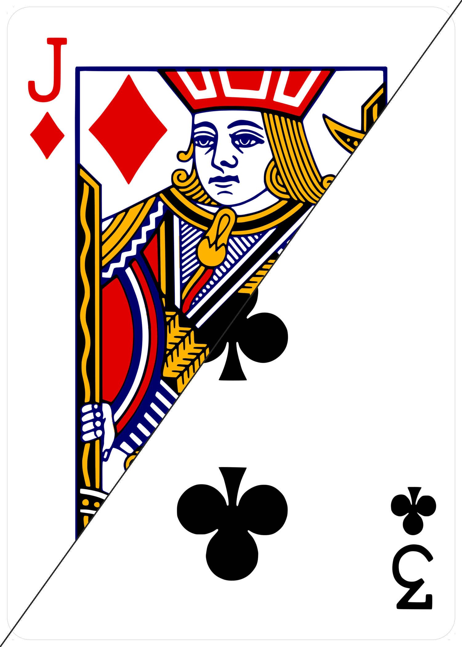
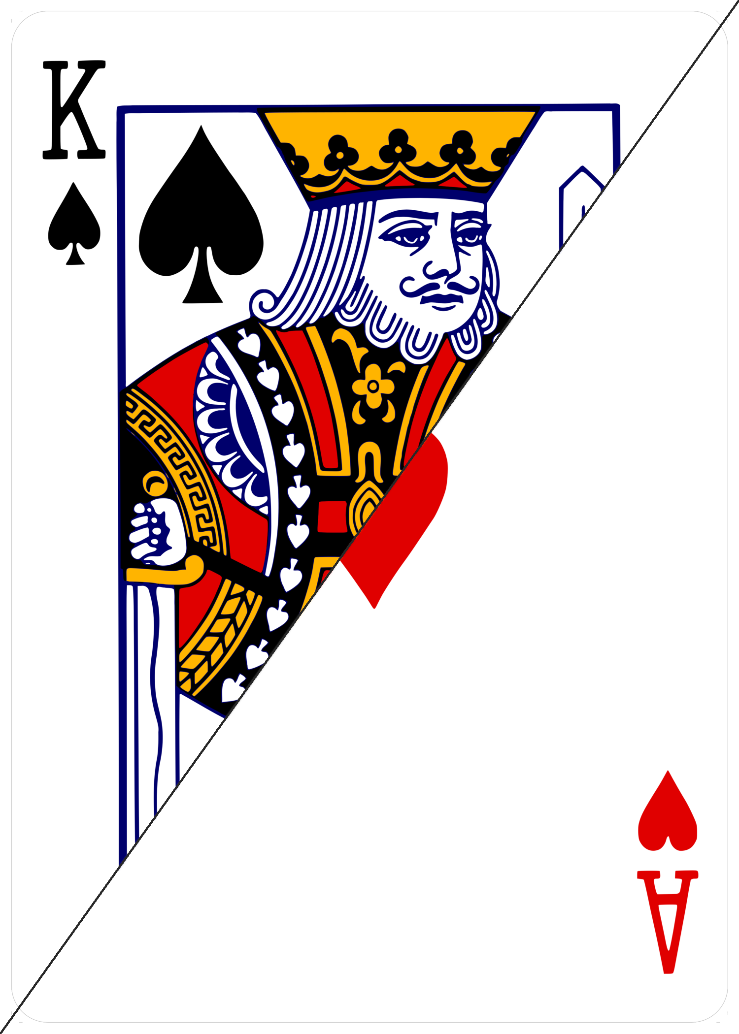
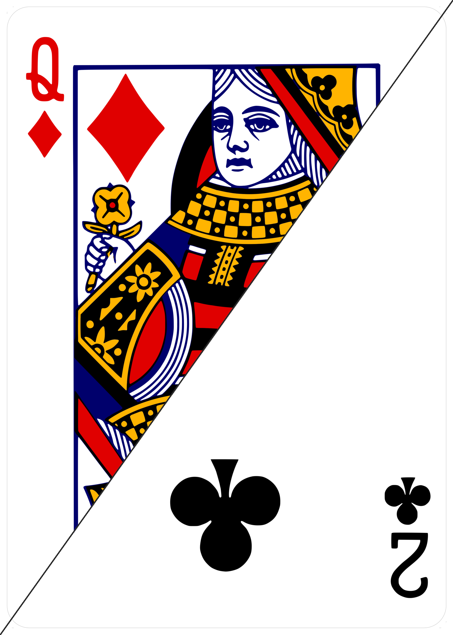
Classic "two cards in one" gimmick: a hard diagonal seam from bottom-left to top-right, each triangle carrying its own authentic corner index so it reads correctly from either side. Jack♦/3♣ as requested, plus two higher-contrast pairs (face-card vs. ace, and a second face/low-card combo) to compare how legible the seam is depending on art density.
The full 52-card LGPL-licensed vector deck this project is built from (Chris Aguilar's "Vectorized Playing Cards"). Click any card to open/download its .svg. Full set + license/attribution text is in the ZIP above.